Introduction#
In this notebook I am using the housing data set from Ames, Iowa (can be found on Kaggle) where I will be performing:
[2]:
from matplotlib import ticker
from scipy.optimize import curve_fit
import matplotlib.pyplot as plt
import seaborn as sns
import pandas as pd
import numpy as np
import os
import warnings
warnings.filterwarnings("ignore")
[66]:
def missing_vals(df):
    '''
    Get the number and percentage of missing values per column in
    the given data frame.

    Args:
        df (pandas.DataFrame): Data frame with the data.

    Returns:
        null_df (pandas.DataFrame): Data frame consisting of two
            columns, 'count' and 'percent', representing the number
            and percentage of columns missing in the data frame,
            respectively. The index will be the column names.
            Will only return columns that are missing values. If
            there are no missing values it will return an empty
            data frame.
    '''
    null_vals = df.isnull().sum(axis=0)
    null_vals = null_vals[null_vals > 0].sort_values(ascending=False).rename('count')
    null_perc = null_vals / df.shape[0] * 100
    null_perc.name = 'percent'
    null_df = pd.concat([null_vals, null_perc], axis=1)
    return null_df

def calc_iqr(arr):
    per = np.percentile(arr, [25, 75])
    iqr = per[1] - per[0]
    return per, iqr

def get_iqr_vals(df):
    per, iqr = calc_iqr(df['SalePrice'].values)
    tmp = df.loc[(df['SalePrice'] < per[0] - 1.5*iqr) | (df['SalePrice'] > per[1] + 1.5*iqr), 'SalePrice']
    return tmp.count()

def do_loop(idx1, idx2, msg):
    ''' Helper function for ensuring all the columns have a description '''
    for i in idx1:
        is_missing = True
        for j in idx2:
            if i == j:
                is_missing = False
                break
        if is_missing:
            print(msg.format(i))

def compare_feature_keys(keys, columns):
    ''' Helper function for column descriptions '''
    print("Keys missing in description")
    do_loop(columns, keys, "  - Missing key {} in description")
    print("Keys missing in description")
    do_loop(keys, columns, "  - Missing key {} in data set")

def highlight_max(s, props=''):
    import numpy as np
    return np.where(s == np.nanmax(s.values), props, '')

def gen_cat_matrix(df, x, y, fill=0, color='tab:blue', linewidth=0.9):
    '''
    Generate a heatmap representation of the number of values in a set
    of categorical columns. Uses the heatmap function in seaborn.

    Args:
        df (pandas.DataFrame): Data frame with the pertinent data. This
            can be the complete data frame or a slice.
        x (str): Column name that will be used as the x-axis in the
            heatmap plot.
        y (str): Column name that will be used as the y-axis in the
            heatmap plot.
        fill (int, default=0): Number to use for filling in missing
            values when making the pivot table.
        color (str, default='tab:blue'): Color to use for the box lines.
        linewidth (float, default=0.9): Linewidth for the box lines.
    '''
    import seaborn as sns
    tmp = df.groupby([x, y])[y].value_counts().reset_index()
    pivot = pd.pivot_table(data=tmp, index=x, columns=y, values='count').fillna(fill).astype(int)
    # sns.heatmap(pivot, annot=True, fmt='.0f', linecolor=color,
    #             linewidth=linewidth)
    p = pivot.style
    p.highlight_max(props='color:white;background-color:darkblue', axis=1)
    # p.set_properties(**{'text-align': 'center'})
    p.set_table_styles([
        {'selector': 'th:not(.index_name)', 'props': 'background-color: #000066; color: white; text-align: center'},
        {'selector': 'td', 'props': 'text-align:center; font-weight: bold;'},
    ])
    p.set_properties(**{'width': '100px'})
    return p

def fill_mode(sr):
    ''' Function to calculate the mode and fill in missing values. '''
    mode = sr.dropna().agg(pd.Series.mode)
    return sr.fillna(mode[0])

def replace_price_ticks(ax, xaxis, label='Price'):
    '''
    Replace the plot ticks in the given plot with hard-coded values
    determined for our purpose.

    Note:
        This will create axis ticks spaced every 10e3 units and set
        the tick labels to be in units of thousands.

    Args:
        ax (matplotlib.axis.Axes): Matplotlib Axes object.
        xaxis (bool): Set that we are replacing the xaxis ticks.
        label (str, default='Price'): Label preceeding the units.
    '''
    ticks = np.arange(0, 9e5, 1e5)
    labels = [str(int(round(t/1e3,0))) for t in ticks]
    if xaxis:
        ax.set_xticks(ticks, labels)
        ax.set_xlabel(f'{label} / 10$^3\\times$USD')
    else:
        ax.set_yticks(ticks, labels)
        ax.set_ylabel(f'{label} / 10$^3\\times$USD')

def gen_lotfront_plot(df, group_cols):
    '''
    Function to visualize how the replacement that we make for the missing
    values in the 'LotFrontage' column will affect the overall values. We
    generate a plot for the effect using the average and the median grouping
    by the given columns. We also print out the number of remaining missing
    values in the feature column.

    Note:
        This is hard-coded for the 'LotFrontage' column.

    Args:
        df (pandas.DataFrame): Data frame with the pertinent data.
        group_cols (list): List with the column names that we will group by
            to calculate the mean and make the relvant replacements.
    '''
    import matplotlib.pyplot as plt
    import seaborn as sns
    fig, (ax1, ax2) = plt.subplots(1,2, figsize=(12,6))
    tmp = df.copy()
    sns.scatterplot(y='LotFrontage', x='SalePrice', data=tmp, ax=ax1)
    tmp['LotFrontage'] = tmp.groupby(group_cols)['LotFrontage'].transform(lambda x: x.fillna(x.mean()))
    print('Missing values after average: {}'.format(tmp['LotFrontage'].isnull().sum()))
    idxs = df['LotFrontage'].isnull()
    sns.scatterplot(y='LotFrontage', x='SalePrice', data=tmp.loc[idxs], ax=ax1)
    replace_price_ticks(ax1, True)
    ax1.legend(labels=['Original', 'New values'])
    ax1.set_title('Using average', fontsize=20)
    tmp = df.copy()
    sns.scatterplot(y='LotFrontage', x='SalePrice', data=tmp, ax=ax2)
    tmp['LotFrontage'] = tmp.groupby(group_cols)['LotFrontage'].transform(lambda x: x.fillna(x.median()))
    print('Missing values after median: {}'.format(tmp['LotFrontage'].isnull().sum()))
    idxs = df['LotFrontage'].isnull()
    sns.scatterplot(y='LotFrontage', x='SalePrice', data=tmp.loc[idxs], ax=ax2)
    replace_price_ticks(ax2, True)
    ax2.legend(labels=['Original', 'New values'])
    ax2.set_title('Using median', fontsize=20)
[4]:
with open(os.path.join('_data', 'data_description.txt'), 'r') as fn:
    lines = fn.readlines()
i = 0
keys = {}
contents = {}
while i < len(lines):
    line = lines[i]
    if ':' in line and not line.startswith('  '):
        key, descrip = line.split(':')
        keys[key] = descrip
        if lines[i+2].startswith('  '):
            i += 2
            contents[key] = []
            while lines[i].strip():
                contents[key].append(lines[i].strip())
                i += 1
                if i >= len(lines): break
            contents[key] = '<br>'.join(contents[key])
        else:
            contents[key] = 'No categories'
    i += 1
Studying data#
Looking at the first few rows of the data after reading it.
[5]:
dtypes = dict(MSSubClass=str)
[6]:
df_train = pd.read_csv(os.path.join('_data', 'train.csv'), index_col=0, dtype=dtypes)
df_train.head()
[6]:
| MSSubClass | MSZoning | LotFrontage | LotArea | Street | Alley | LotShape | LandContour | Utilities | LotConfig | ... | PoolArea | PoolQC | Fence | MiscFeature | MiscVal | MoSold | YrSold | SaleType | SaleCondition | SalePrice | |
|---|---|---|---|---|---|---|---|---|---|---|---|---|---|---|---|---|---|---|---|---|---|
| Id | |||||||||||||||||||||
| 1 | 60 | RL | 65.0 | 8450 | Pave | NaN | Reg | Lvl | AllPub | Inside | ... | 0 | NaN | NaN | NaN | 0 | 2 | 2008 | WD | Normal | 208500 |
| 2 | 20 | RL | 80.0 | 9600 | Pave | NaN | Reg | Lvl | AllPub | FR2 | ... | 0 | NaN | NaN | NaN | 0 | 5 | 2007 | WD | Normal | 181500 |
| 3 | 60 | RL | 68.0 | 11250 | Pave | NaN | IR1 | Lvl | AllPub | Inside | ... | 0 | NaN | NaN | NaN | 0 | 9 | 2008 | WD | Normal | 223500 |
| 4 | 70 | RL | 60.0 | 9550 | Pave | NaN | IR1 | Lvl | AllPub | Corner | ... | 0 | NaN | NaN | NaN | 0 | 2 | 2006 | WD | Abnorml | 140000 |
| 5 | 60 | RL | 84.0 | 14260 | Pave | NaN | IR1 | Lvl | AllPub | FR2 | ... | 0 | NaN | NaN | NaN | 0 | 12 | 2008 | WD | Normal | 250000 |
5 rows × 80 columns
Checking for any missing values in the original data set#
[7]:
missing_vals(df_train)
[7]:
| count | percent | |
|---|---|---|
| PoolQC | 1453 | 99.520548 |
| MiscFeature | 1406 | 96.301370 |
| Alley | 1369 | 93.767123 |
| Fence | 1179 | 80.753425 |
| MasVnrType | 872 | 59.726027 |
| FireplaceQu | 690 | 47.260274 |
| LotFrontage | 259 | 17.739726 |
| GarageType | 81 | 5.547945 |
| GarageYrBlt | 81 | 5.547945 |
| GarageFinish | 81 | 5.547945 |
| GarageQual | 81 | 5.547945 |
| GarageCond | 81 | 5.547945 |
| BsmtFinType2 | 38 | 2.602740 |
| BsmtExposure | 38 | 2.602740 |
| BsmtFinType1 | 37 | 2.534247 |
| BsmtCond | 37 | 2.534247 |
| BsmtQual | 37 | 2.534247 |
| MasVnrArea | 8 | 0.547945 |
| Electrical | 1 | 0.068493 |
Making sure that there is a description for every available feature column#
The column 'SalePrice' is expected as this is the label we are trying to predict. It is not a feature in the data set.
[8]:
compare_feature_keys(keys.keys(), df_train.columns)
Keys missing in description
  - Missing key SalePrice in description
Keys missing in description
Data Preprocessing#
Now that I know there are missing values in the data set 'train.csv' I will go ahead and sort out what to do with those missing values.
For the sake of brevity when I come to filling in missing data and imputing values based on other columns I will just be using the data from this single imputation. I am aware that it is often better to consider multiple imputations and to run a model for each of those methods as this can give a better performing model for unobserved data that may not fit the trends in the imputation.
[9]:
df = df_train.copy()
Outliers#
The first thing that I want to see is how normally distributed the housing price values are distributed.
[10]:
fig, ax = plt.subplots()
sns.histplot(data=df, x='SalePrice', bins=40, ax=ax)
ax.xaxis.set_minor_locator(ticker.MultipleLocator(2.5e4))
ticks = np.arange(0, 9e5, 1e5)
labels = [str(int(round(t/1e3,0))) for t in ticks]
ax.set_xticks(ticks, labels)
ax.set_xlabel('Price / 10$^3\\times$USD')
[10]:
Text(0.5, 0, 'Price / 10$^3\\times$USD')
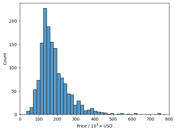
We can see that there is a very nice normal distribution of values with only a few values above 500,000 with the vast majority of values in the 120,000 to 140,000 range. I feel confident with saying that as a whole the housing prices are normally distributed as a whole. However, the houses are located in different neighborhoods so it is worthwhile to look at the prices are distributed among the different neighborhoods.
Let’s do this with a simple box plot that will also give an idea of outliers.
[11]:
fig, ax = plt.subplots(figsize=(16,6), dpi=100)
sns.boxplot(x='Neighborhood', y='SalePrice', data=df)
ax.tick_params(axis='x', labelrotation=90)
replace_price_ticks(ax, False)
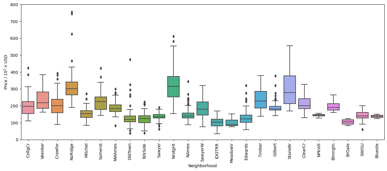
In the figure above we can see that there are many data points that are identified by Seaborn to be outside of the \(1.5 \times \text{IQR}\) (Inter-Quartile Region). Let’s look at how many are outside of this range for each neighborhood to see how much of the data falls outside this range.
[12]:
tmp = df.groupby('Neighborhood').apply(get_iqr_vals)
print("Total outside 1.5*IQR: {}".format(tmp.sum()))
tmp.sort_values(ascending=False)
Total outside 1.5*IQR: 65
[12]:
Neighborhood
NAmes      13
OldTown     8
Gilbert     8
BrkSide     6
Edwards     5
Sawyer      4
NWAmes      4
NoRidge     4
Crawfor     3
Mitchel     3
CollgCr     2
Somerst     2
NridgHt     2
SWISU       1
StoneBr     0
Timber      0
SawyerW     0
Blmngtn     0
NPkVill     0
Blueste     0
MeadowV     0
IDOTRR      0
ClearCr     0
BrDale      0
Veenker     0
dtype: int64
So there are a total of 65 values that fall outside of the \(1.5 \times \text{IQR}\), corresponding to approximately 4.5% of the data set. While these can in fact be outliers in the data set, this criteria alone is not enough to consider them outliers as they may have some useful information to the overall trends that affect the sale prices of homes. Additionally, looking at the box plots there are many points that are close to the cutoff set by Seaborn.
With this in mind it would be a good idea to find which features have a large correlation with sale prices and identify any points that break from the actual trend. This would then affect our model as it would decrease the accuracy and reliability.
Let’s start with looking at the features with the highest correlation with the sale price.
[13]:
df.corr(numeric_only=True)['SalePrice'].sort_values(key=abs, ascending=False).head(12)
[13]:
SalePrice       1.000000
OverallQual     0.790982
GrLivArea       0.708624
GarageCars      0.640409
GarageArea      0.623431
TotalBsmtSF     0.613581
1stFlrSF        0.605852
FullBath        0.560664
TotRmsAbvGrd    0.533723
YearBuilt       0.522897
YearRemodAdd    0.507101
GarageYrBlt     0.486362
Name: SalePrice, dtype: float64
We see that the feature columns 'OverallQual' and 'GrLivArea' have a correlation value over 70% and these features might be a good place to start looking for outliers.
Let’s look at the price of the house with respect to the overall quality.
[14]:
fig, ax = plt.subplots()
sns.scatterplot(y='SalePrice', x='OverallQual', data=df, ax=ax)
iqr_high = []
iqr_low = []
median = []
x = []
for qual, data in df.groupby('OverallQual'):
    if data.shape[0] < 10:
        msg = "There are {} values with a quality of {}. Not plotting the IQR."
        print(msg.format(data.shape[0], qual))
        continue
    per, iqr = calc_iqr(data['SalePrice'].values)
    x.append(qual)
    iqr_high.append(per[1]+1.5*iqr)
    iqr_low.append(per[0]-1.5*iqr)
    median.append(data['SalePrice'].median())
ax.plot(x, iqr_low, color='tab:cyan')
ax.plot(x, iqr_high, color='tab:red')
ax.plot(x, median, color='k', linestyle='--')
replace_price_ticks(ax, False)
ax.xaxis.set_major_locator(ticker.MultipleLocator(1))
ax.set_xlabel('Overall quality of home')
There are 2 values with a quality of 1. Not plotting the IQR.
There are 3 values with a quality of 2. Not plotting the IQR.
[14]:
Text(0.5, 0, 'Overall quality of home')
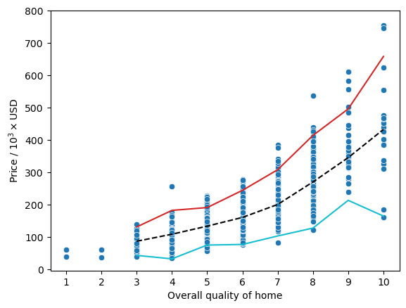
Here, we can actually see a pretty good relationship between the price of a home and the overall quality as denoted by the black dashed line representing the median for each quality rating. However, we can also see that there are a couple houses that have an overall quality rating of 10 and a price less than 200,000 where the cyan line representing \(1.5 \times \text{IQR}\) subtracted from the 25th percentile has a small dip in the trend.
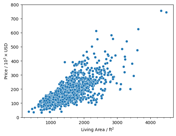
Before we jump to conclusions let’s look at another plot with the 'GrLivArea' which is the above ground living area.
[15]:
fig, ax = plt.subplots()
sns.scatterplot(y='SalePrice', x='GrLivArea', data=df, ax=ax)
replace_price_ticks(ax, False)
ax.xaxis.set_minor_locator(ticker.MultipleLocator(200))
ax.set_xlabel('Living Area / ft$^2$')
[15]:
Text(0.5, 0, 'Living Area / ft$^2$')
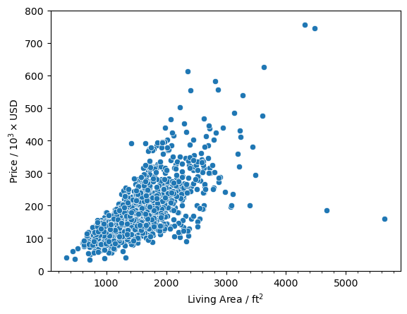
And we see that there are two points that have a square footage greater than 4000 and a price less than 200,000. Now let’s look at the data points and see if they are the same.
[16]:
df.loc[(df['OverallQual'] == 10) & (df['SalePrice'] < 200e3)]
[16]:
| MSSubClass | MSZoning | LotFrontage | LotArea | Street | Alley | LotShape | LandContour | Utilities | LotConfig | ... | PoolArea | PoolQC | Fence | MiscFeature | MiscVal | MoSold | YrSold | SaleType | SaleCondition | SalePrice | |
|---|---|---|---|---|---|---|---|---|---|---|---|---|---|---|---|---|---|---|---|---|---|
| Id | |||||||||||||||||||||
| 524 | 60 | RL | 130.0 | 40094 | Pave | NaN | IR1 | Bnk | AllPub | Inside | ... | 0 | NaN | NaN | NaN | 0 | 10 | 2007 | New | Partial | 184750 |
| 1299 | 60 | RL | 313.0 | 63887 | Pave | NaN | IR3 | Bnk | AllPub | Corner | ... | 480 | Gd | NaN | NaN | 0 | 1 | 2008 | New | Partial | 160000 |
2 rows × 80 columns
[17]:
df.loc[(df['GrLivArea'] > 4000) & (df['SalePrice'] < 200e3)]
[17]:
| MSSubClass | MSZoning | LotFrontage | LotArea | Street | Alley | LotShape | LandContour | Utilities | LotConfig | ... | PoolArea | PoolQC | Fence | MiscFeature | MiscVal | MoSold | YrSold | SaleType | SaleCondition | SalePrice | |
|---|---|---|---|---|---|---|---|---|---|---|---|---|---|---|---|---|---|---|---|---|---|
| Id | |||||||||||||||||||||
| 524 | 60 | RL | 130.0 | 40094 | Pave | NaN | IR1 | Bnk | AllPub | Inside | ... | 0 | NaN | NaN | NaN | 0 | 10 | 2007 | New | Partial | 184750 |
| 1299 | 60 | RL | 313.0 | 63887 | Pave | NaN | IR3 | Bnk | AllPub | Corner | ... | 480 | Gd | NaN | NaN | 0 | 1 | 2008 | New | Partial | 160000 |
2 rows × 80 columns
And we can see that they are the same data points. I am labeling these as outlier points since they don’t fall nicely within the overall trend that we can see for 'OverallQual' and 'GrLivArea'. The values that we initially found to be above 500,000 are not outliers because they actually fall within the trends. They are just on the expensive end of the spectrum so they may give us valuable information for the model.
[18]:
idxs = df.loc[(df['OverallQual'] == 10) & (df['SalePrice'] < 200e3)].index
df.drop(idxs, axis=0, inplace=True)
[19]:
fig, ax = plt.subplots()
sns.scatterplot(y='SalePrice', x='OverallQual', data=df, ax=ax)
iqr_high = []
iqr_low = []
median = []
x = []
for qual, data in df.groupby('OverallQual'):
    if data.shape[0] < 10:
        msg = "There are {} values with a quality of {}. Not plotting the IQR."
        print(msg.format(data.shape[0], qual))
        continue
    per, iqr = calc_iqr(data['SalePrice'].values)
    x.append(qual)
    iqr_high.append(per[1]+1.5*iqr)
    iqr_low.append(per[0]-1.5*iqr)
    median.append(data['SalePrice'].median())
ax.plot(x, iqr_low, color='tab:cyan')
ax.plot(x, iqr_high, color='tab:red')
ax.plot(x, median, color='k', linestyle='--')
replace_price_ticks(ax, False)
ax.xaxis.set_major_locator(ticker.MultipleLocator(1))
ax.set_xlabel('Overall quality of home')
There are 2 values with a quality of 1. Not plotting the IQR.
There are 3 values with a quality of 2. Not plotting the IQR.
[19]:
Text(0.5, 0, 'Overall quality of home')

[20]:
fig, ax = plt.subplots()
sns.scatterplot(y='SalePrice', x='GrLivArea', data=df, ax=ax)
replace_price_ticks(ax, False)
ax.xaxis.set_minor_locator(ticker.MultipleLocator(200))
ax.set_xlabel('Living Area / ft$^2$')
[20]:
Text(0.5, 0, 'Living Area / ft$^2$')
[21]:
df.corr(numeric_only=True)['SalePrice'].sort_values(key=abs, ascending=False).head(8)
[21]:
SalePrice      1.000000
OverallQual    0.795774
GrLivArea      0.734968
TotalBsmtSF    0.651153
GarageCars     0.641047
1stFlrSF       0.631530
GarageArea     0.629217
FullBath       0.562165
Name: SalePrice, dtype: float64
Now we have a nicely defined linear trend for the sale price with respect to the living area. We can also see that the correlation values went up slightly for 'OverallQual' and 'GrLivArea'.
Electrical#
First thing I want to determine is if there are any rows that I can simply drop because getting the values for the missing data might just not make too much sense and I can simply drop the data point altogether.
So let’s look at the number of missing values again.
[22]:
missing_vals(df)
[22]:
| count | percent | |
|---|---|---|
| PoolQC | 1452 | 99.588477 |
| MiscFeature | 1404 | 96.296296 |
| Alley | 1367 | 93.758573 |
| Fence | 1177 | 80.727023 |
| MasVnrType | 872 | 59.807956 |
| FireplaceQu | 690 | 47.325103 |
| LotFrontage | 259 | 17.764060 |
| GarageType | 81 | 5.555556 |
| GarageYrBlt | 81 | 5.555556 |
| GarageFinish | 81 | 5.555556 |
| GarageQual | 81 | 5.555556 |
| GarageCond | 81 | 5.555556 |
| BsmtFinType2 | 38 | 2.606310 |
| BsmtExposure | 38 | 2.606310 |
| BsmtFinType1 | 37 | 2.537723 |
| BsmtCond | 37 | 2.537723 |
| BsmtQual | 37 | 2.537723 |
| MasVnrArea | 8 | 0.548697 |
| Electrical | 1 | 0.068587 |
The more curious one to study is the feature column 'Electrical' as there is only one missing value that accounts for 0.07% of the availble data. Before I just drop the row I want to look at the description of it which is
Electrical: Electrical system

       SBrkr    Standard Circuit Breakers & Romex
       FuseA    Fuse Box over 60 AMP and all Romex wiring (Average)
       FuseF    60 AMP Fuse Box and mostly Romex wiring (Fair)
       FuseP    60 AMP Fuse Box and mostly knob & tube wiring (poor)
       Mix  Mixed
Typically, since there is only one row that is missing data it can be safe enough to just drop that row entirely as it only accounts for 0.07% of the data set. However, I want to try to infer the value based on some metric.
First let’s look at some of the columns associated with the row that is missing data. I have identified the dwelling type ('MSSubClass'), zoning type ('MSZoning'), and neighborhood ('Neighborhood') as potential columns that may be important in determining what kind of electrical system the building should have.
[23]:
df.loc[df['Electrical'].isnull(), ['Electrical', 'MSSubClass', 'MSZoning', 'Neighborhood', 'SalePrice']]
[23]:
| Electrical | MSSubClass | MSZoning | Neighborhood | SalePrice | |
|---|---|---|---|---|---|
| Id | |||||
| 1380 | NaN | 80 | RL | Timber | 167500 |
Before we do anything let’s look at some of the statistics from the sale price ('SalePrice') with the type of electrical system.
[24]:
df.groupby('Electrical')['SalePrice'].describe().sort_values(by=['mean'], ascending=False)
[24]:
| count | mean | std | min | 25% | 50% | 75% | max | |
|---|---|---|---|---|---|---|---|---|
| Electrical | ||||||||
| SBrkr | 1332.0 | 186846.810060 | 79913.027373 | 37900.0 | 134500.0 | 170000.0 | 221000.00 | 755000.0 |
| FuseA | 94.0 | 122196.893617 | 37511.376615 | 34900.0 | 98500.0 | 121250.0 | 143531.25 | 239000.0 |
| FuseF | 27.0 | 107675.444444 | 30636.507376 | 39300.0 | 88500.0 | 115000.0 | 129950.00 | 169500.0 |
| FuseP | 3.0 | 97333.333333 | 34645.827070 | 73000.0 | 77500.0 | 82000.0 | 109500.00 | 137000.0 |
| Mix | 1.0 | 67000.000000 | NaN | 67000.0 | 67000.0 | 67000.0 | 67000.00 | 67000.0 |
We can see that the average price is actually the highest with the standard circuit breakers and romex ('SBrkr'). However, you can also see that and electrical system 'SBrkr' is actually in over 90% of the homes so it’s hard to make any conclusions on the effect of the electrical system on the final sale price.
Now let’s try to take a look at the distributions in the other categorical values.
We start with a Box Plot of the sale prices against the electrical system used.
[25]:
sns.boxplot(x='SalePrice', y='Electrical', data=df,
            order=['SBrkr', 'FuseA', 'FuseF', 'FuseP', 'Mix'])
[25]:
<Axes: xlabel='SalePrice', ylabel='Electrical'>
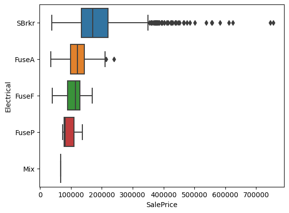
Since this is just a pictorial representation of the statistical data, the overall conclusions are the same. However, we can see that the median of the data for 'SBrkr' is in the lower range of the distribution and there are a lot of points outside of the \(1.5 \times \text{IQR}\) range as defined in Seaborn. While this can, in some cases, be identified as outliers, this is clearly not that case as the points are continuous.
Next we have a set of pictorial representations of the Pandas pivot table to look at the total number of electrical systems in each of the categorical classifications. At the end we will break down each of the plots and try to connect them with our data.
We start with the type dwelling.
[67]:
gen_cat_matrix(df=df, x='MSSubClass', y='Electrical')
[67]:
| Electrical | FuseA | FuseF | FuseP | Mix | SBrkr |
|---|---|---|---|---|---|
| MSSubClass | |||||
| 120 | 0 | 0 | 0 | 0 | 87 |
| 160 | 0 | 0 | 0 | 0 | 63 |
| 180 | 0 | 0 | 0 | 0 | 10 |
| 190 | 5 | 1 | 1 | 0 | 23 |
| 20 | 31 | 5 | 0 | 0 | 500 |
| 30 | 18 | 4 | 1 | 1 | 45 |
| 40 | 2 | 0 | 0 | 0 | 2 |
| 45 | 3 | 2 | 0 | 0 | 7 |
| 50 | 20 | 8 | 0 | 0 | 116 |
| 60 | 0 | 0 | 0 | 0 | 297 |
| 70 | 8 | 2 | 0 | 0 | 50 |
| 75 | 2 | 0 | 0 | 0 | 14 |
| 80 | 0 | 1 | 0 | 0 | 56 |
| 85 | 0 | 0 | 0 | 0 | 20 |
| 90 | 5 | 4 | 1 | 0 | 42 |
Next is the zoning type.
[68]:
gen_cat_matrix(df=df, x='MSZoning', y='Electrical')
[68]:
| Electrical | FuseA | FuseF | FuseP | Mix | SBrkr |
|---|---|---|---|---|---|
| MSZoning | |||||
| C (all) | 4 | 0 | 0 | 0 | 6 |
| FV | 0 | 0 | 0 | 0 | 65 |
| RH | 4 | 1 | 0 | 0 | 11 |
| RL | 56 | 18 | 1 | 0 | 1073 |
| RM | 30 | 8 | 2 | 1 | 177 |
The neighborhood the dwelling is located in.
[69]:
gen_cat_matrix(df=df, x='Neighborhood', y='Electrical', linewidth=0.5)
[69]:
| Electrical | FuseA | FuseF | FuseP | Mix | SBrkr |
|---|---|---|---|---|---|
| Neighborhood | |||||
| Blmngtn | 0 | 0 | 0 | 0 | 17 |
| Blueste | 0 | 0 | 0 | 0 | 2 |
| BrDale | 0 | 0 | 0 | 0 | 16 |
| BrkSide | 13 | 3 | 0 | 0 | 42 |
| ClearCr | 2 | 1 | 0 | 0 | 25 |
| CollgCr | 0 | 0 | 0 | 0 | 150 |
| Crawfor | 3 | 2 | 0 | 0 | 46 |
| Edwards | 12 | 9 | 1 | 0 | 76 |
| Gilbert | 0 | 0 | 0 | 0 | 79 |
| IDOTRR | 10 | 4 | 0 | 1 | 22 |
| MeadowV | 0 | 0 | 0 | 0 | 17 |
| Mitchel | 1 | 0 | 0 | 0 | 48 |
| NAmes | 27 | 3 | 0 | 0 | 195 |
| NPkVill | 0 | 0 | 0 | 0 | 9 |
| NWAmes | 0 | 0 | 0 | 0 | 73 |
| NoRidge | 0 | 0 | 0 | 0 | 41 |
| NridgHt | 0 | 0 | 0 | 0 | 77 |
| OldTown | 21 | 3 | 2 | 0 | 87 |
| SWISU | 3 | 2 | 0 | 0 | 20 |
| Sawyer | 0 | 0 | 0 | 0 | 74 |
| SawyerW | 1 | 0 | 0 | 0 | 58 |
| Somerst | 0 | 0 | 0 | 0 | 86 |
| StoneBr | 0 | 0 | 0 | 0 | 25 |
| Timber | 1 | 0 | 0 | 0 | 36 |
| Veenker | 0 | 0 | 0 | 0 | 11 |
Based on the plots above I can see that there is no real connection between what type of electrical system a building has and its location, dwelling type, or zoning type. They pretty much all have a standard breaker system, 'SBrkr'. With this in mind I believe that it is safe to perfrom a replacement of the missing value with the mode for the neighborhood the home is located.
The next two are trying to identify any relationship between the zoning type and the type of dwelling and neighborhood, respectively. I do not believe that this will give any extra valuable information, however, the North Ames neighborhood, 'NAmes', has the highest number of homes that use an electrcial system classified as 'FuseA'. If there were more data points missing, it would be interesting to see if it would be necessary to consider some kind of distribution to try to retain the
original ratios the same.
[70]:
gen_cat_matrix(df=df, x='MSSubClass', y='MSZoning')
[70]:
| MSZoning | C (all) | FV | RH | RL | RM |
|---|---|---|---|---|---|
| MSSubClass | |||||
| 120 | 0 | 5 | 2 | 59 | 21 |
| 160 | 0 | 22 | 0 | 11 | 30 |
| 180 | 0 | 0 | 0 | 0 | 10 |
| 190 | 1 | 0 | 2 | 16 | 11 |
| 20 | 2 | 13 | 3 | 508 | 10 |
| 30 | 2 | 0 | 1 | 33 | 33 |
| 40 | 0 | 0 | 0 | 2 | 2 |
| 45 | 0 | 0 | 1 | 4 | 7 |
| 50 | 4 | 0 | 1 | 88 | 51 |
| 60 | 0 | 25 | 0 | 271 | 1 |
| 70 | 1 | 0 | 3 | 30 | 26 |
| 75 | 0 | 0 | 0 | 6 | 10 |
| 80 | 0 | 0 | 0 | 58 | 0 |
| 85 | 0 | 0 | 0 | 20 | 0 |
| 90 | 0 | 0 | 3 | 43 | 6 |
[71]:
gen_cat_matrix(df=df, x='Neighborhood', y='MSZoning', linewidth=0.5)
[71]:
| MSZoning | C (all) | FV | RH | RL | RM |
|---|---|---|---|---|---|
| Neighborhood | |||||
| Blmngtn | 0 | 0 | 0 | 16 | 1 |
| Blueste | 0 | 0 | 0 | 0 | 2 |
| BrDale | 0 | 0 | 0 | 0 | 16 |
| BrkSide | 0 | 0 | 0 | 28 | 30 |
| ClearCr | 0 | 0 | 0 | 28 | 0 |
| CollgCr | 0 | 0 | 0 | 140 | 10 |
| Crawfor | 0 | 0 | 2 | 46 | 3 |
| Edwards | 0 | 0 | 2 | 88 | 8 |
| Gilbert | 0 | 0 | 0 | 79 | 0 |
| IDOTRR | 9 | 0 | 0 | 0 | 28 |
| MeadowV | 0 | 0 | 0 | 0 | 17 |
| Mitchel | 0 | 0 | 0 | 44 | 5 |
| NAmes | 0 | 0 | 2 | 223 | 0 |
| NPkVill | 0 | 0 | 0 | 9 | 0 |
| NWAmes | 0 | 0 | 0 | 73 | 0 |
| NoRidge | 0 | 0 | 0 | 41 | 0 |
| NridgHt | 0 | 0 | 0 | 76 | 1 |
| OldTown | 1 | 0 | 0 | 17 | 95 |
| SWISU | 0 | 0 | 5 | 20 | 0 |
| Sawyer | 0 | 0 | 0 | 72 | 2 |
| SawyerW | 0 | 0 | 5 | 54 | 0 |
| Somerst | 0 | 65 | 0 | 21 | 0 |
| StoneBr | 0 | 0 | 0 | 25 | 0 |
| Timber | 0 | 0 | 0 | 38 | 0 |
| Veenker | 0 | 0 | 0 | 11 | 0 |
So as mentioned before there is no extra information that we will gather from the two plots above.
Now let’s make the replacement with the overall mode of the neighborhood the missing value is in.
[30]:
group_cols = ['Neighborhood', 'MSSubClass', 'MSZoning']
df['Electrical'] = df.groupby(group_cols)['Electrical'].transform(fill_mode)
[31]:
missing_vals(df)
[31]:
| count | percent | |
|---|---|---|
| PoolQC | 1452 | 99.588477 |
| MiscFeature | 1404 | 96.296296 |
| Alley | 1367 | 93.758573 |
| Fence | 1177 | 80.727023 |
| MasVnrType | 872 | 59.807956 |
| FireplaceQu | 690 | 47.325103 |
| LotFrontage | 259 | 17.764060 |
| GarageType | 81 | 5.555556 |
| GarageYrBlt | 81 | 5.555556 |
| GarageFinish | 81 | 5.555556 |
| GarageQual | 81 | 5.555556 |
| GarageCond | 81 | 5.555556 |
| BsmtExposure | 38 | 2.606310 |
| BsmtFinType2 | 38 | 2.606310 |
| BsmtFinType1 | 37 | 2.537723 |
| BsmtCond | 37 | 2.537723 |
| BsmtQual | 37 | 2.537723 |
| MasVnrArea | 8 | 0.548697 |
And we have gotten rid of the missing value.
In reality, it might actually be good enough to just drop that row altogether since it is one row accounting for 0.07% of the data set. However, if there are more values missing, ~40 rows or 2.7%, just dropping the rows might not be the best thing to do. Especially if we end up doing this for multiple columns that may not share the same indeces. It can really add up in the end.
Masonry Veneer#
From the previous cell we can see that we are missing values in the 'MasVnrArea' and 'MasVnrType' columns. Below is a description of the columns.
MasVnrType: Masonry veneer type

       BrkCmn   Brick Common
       BrkFace  Brick Face
       CBlock   Cinder Block
       None None
       Stone    Stone

MasVnrArea: Masonry veneer area in square feet
So we can see that it has to do with the masonry veneer that the house has. More importantly, we can see that for the 'MasVnrType', when there is a missing value it just means that there is no masonry veneer. This can be further supported by the 'MasVnrArea', which is the area covered by the masonry veneer and should be zero if the 'MasVnrType' is missing a value. However, we must be careful as the 'MasVnrArea' feature is missing some data points. As this is a numerical value it
might be hard to determine what it should be. I will go into this one in more detail later on.
So let’s first take where the values of 'MasVnrType' is missing a value and see what are the values of 'MasVnrArea'.
[32]:
df.loc[df['MasVnrType'].isnull(), ['MasVnrType', 'MasVnrArea']].value_counts(dropna=False)
[32]:
MasVnrType  MasVnrArea
NaN         0.0           859
            NaN             8
            1.0             2
            288.0           1
            312.0           1
            344.0           1
Name: count, dtype: int64
What we see is that there are a lot of places where the 'MasVnrType' is missing a value and 'MasVnrArea' is 0.0. However, when we were looking at the percentges of missing values above we could see that the 'MasVnrArea' feature was missing values as well and we can see that here.
Therefore, we have to be careful in how we perform the replacement as we must replace the NaN values in 'MasVnrType' for 'None' only where 'MasVnrArea' is 0.0.
[33]:
df.loc[(df['MasVnrType'].isnull()) & (df['MasVnrArea'] == 0.0), ['MasVnrType']] = 'None'
Now let’s try to determine what we should do with the other values in these columns.
[34]:
df.loc[df['MasVnrType'].isnull(), ['MasVnrType', 'MasVnrArea']].value_counts(dropna=False)
[34]:
MasVnrType  MasVnrArea
NaN         NaN           8
            1.0           2
            288.0         1
            312.0         1
            344.0         1
Name: count, dtype: int64
Now we are just missing values when 'MasVnrArea' is either NaN or non-zero.
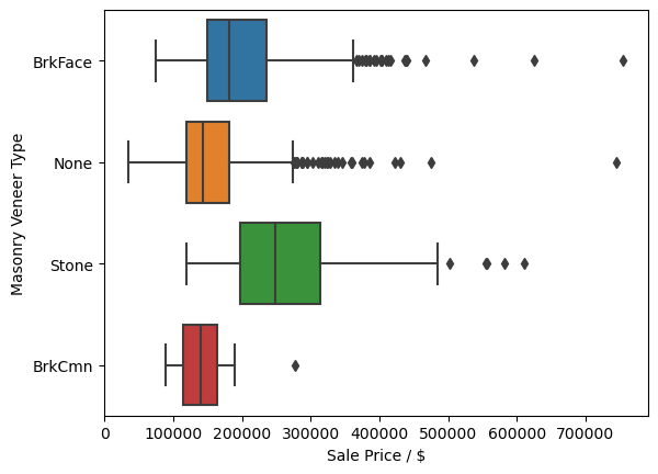
Let’s look into the distribution of the values with respect to the sale price. What I want to determine is how correlated are the values and will some simple replacements create outliers in our data set.
[35]:
sns.boxplot(x='SalePrice', y='MasVnrType', data=df)
plt.ylabel('Masonry Veneer Type')
plt.xlabel('Sale Price / $')
[35]:
Text(0.5, 0, 'Sale Price / $')
[36]:
sns.scatterplot(x='SalePrice', y='MasVnrArea', data=df)
plt.ylabel('Masonry Veneer Area / ft$^2$')
plt.xlabel('Sale Price / $')
[36]:
Text(0.5, 0, 'Sale Price / $')
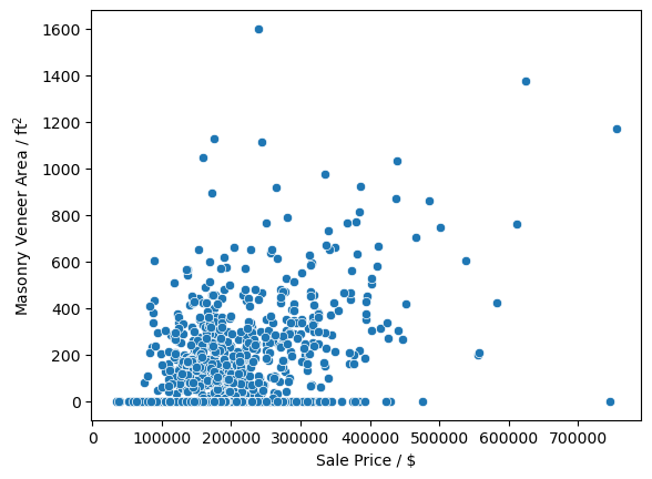
There does not seem to ba a very large correlation between the type of masonry veneer or its type on the sale price of a home. Due to this I will go ahead and replace all NaN values with 0.0 and 'None' in the 'MasVnrArea' and 'MasVnrType', respectively. Since there is no large correlation between the values and the sale price I feel confident in also making the replacement of all the values of 'MasVnrType' with 'None', even when the 'MasVnrArea' is not zero.
[37]:
df['MasVnrArea'] = df['MasVnrArea'].fillna(0.0)
df['MasVnrType'] = df['MasVnrType'].fillna('None')
[38]:
missing_vals(df)
[38]:
| count | percent | |
|---|---|---|
| PoolQC | 1452 | 99.588477 |
| MiscFeature | 1404 | 96.296296 |
| Alley | 1367 | 93.758573 |
| Fence | 1177 | 80.727023 |
| FireplaceQu | 690 | 47.325103 |
| LotFrontage | 259 | 17.764060 |
| GarageType | 81 | 5.555556 |
| GarageYrBlt | 81 | 5.555556 |
| GarageFinish | 81 | 5.555556 |
| GarageQual | 81 | 5.555556 |
| GarageCond | 81 | 5.555556 |
| BsmtExposure | 38 | 2.606310 |
| BsmtFinType2 | 38 | 2.606310 |
| BsmtQual | 37 | 2.537723 |
| BsmtCond | 37 | 2.537723 |
| BsmtFinType1 | 37 | 2.537723 |
And now we have no missing values for the 'MasVnrType' when the 'MasVnrArea' is zero.
Basement#
The next values that I want to tackle are going to be concerned with the basement data. The description for all the available feature columns for basements are
BsmtQual: Evaluates the height of the basement

       Ex   Excellent (100+ inches)
       Gd   Good (90-99 inches)
       TA   Typical (80-89 inches)
       Fa   Fair (70-79 inches)
       Po   Poor (<70 inches
       NA   No Basement

BsmtCond: Evaluates the general condition of the basement

       Ex   Excellent
       Gd   Good
       TA   Typical - slight dampness allowed
       Fa   Fair - dampness or some cracking or settling
       Po   Poor - Severe cracking, settling, or wetness
       NA   No Basement

BsmtExposure: Refers to walkout or garden level walls

       Gd   Good Exposure
       Av   Average Exposure (split levels or foyers typically score average or above)
       Mn   Mimimum Exposure
       No   No Exposure
       NA   No Basement

BsmtFinType1: Rating of basement finished area

       GLQ  Good Living Quarters
       ALQ  Average Living Quarters
       BLQ  Below Average Living Quarters
       Rec  Average Rec Room
       LwQ  Low Quality
       Unf  Unfinshed
       NA   No Basement

BsmtFinSF1: Type 1 finished square feet

BsmtFinType2: Rating of basement finished area (if multiple types)

       GLQ  Good Living Quarters
       ALQ  Average Living Quarters
       BLQ  Below Average Living Quarters
       Rec  Average Rec Room
       LwQ  Low Quality
       Unf  Unfinshed
       NA   No Basement

BsmtFinSF2: Type 2 finished square feet

BsmtUnfSF: Unfinished square feet of basement area

TotalBsmtSF: Total square feet of basement area
So, similar to before we can see that a lot of the data that is missing for the basements is categorical and we can probably fill in a lot of the NaN values with 'None' as there is probably no basement there.
Let’s confirm this below by getting the square footage and other things like we did for the 'MasVnrType' feature.
[39]:
df.loc[df['BsmtCond'].isnull(), [x for x in df.columns if 'bsmt' in x.lower()]].value_counts(dropna=False)
[39]:
BsmtQual  BsmtCond  BsmtExposure  BsmtFinType1  BsmtFinSF1  BsmtFinType2  BsmtFinSF2  BsmtUnfSF  TotalBsmtSF  BsmtFullBath  BsmtHalfBath
NaN       NaN       NaN           NaN           0           NaN           0           0          0            0             0               37
Name: count, dtype: int64
And we can see that for all the categorical values, if the numerical features, 'BsmtFinSF1', 'BsmtFinSF2', 'BsmtUnfSF', and 'TotalBsmtSF', it is missing a value, supporting our initial guess. However, looking at the data frame for the missing values
[40]:
missing_vals(df).loc[['BsmtQual', 'BsmtCond', 'BsmtExposure', 'BsmtFinType1', 'BsmtFinType2']]
[40]:
| count | percent | |
|---|---|---|
| BsmtQual | 37 | 2.537723 |
| BsmtCond | 37 | 2.537723 |
| BsmtExposure | 38 | 2.606310 |
| BsmtFinType1 | 37 | 2.537723 |
| BsmtFinType2 | 38 | 2.606310 |
Let’s go ahead and replace the categorical values for all the columns when 'BsmtCond' is NaN with 'None'.
[41]:
cat_cols = ['BsmtQual', 'BsmtCond', 'BsmtExposure', 'BsmtFinType1', 'BsmtFinType2']
df.loc[df['BsmtCond'].isnull(), cat_cols] = 'None'
Let’s check for missing values.
[42]:
missing_vals(df)
[42]:
| count | percent | |
|---|---|---|
| PoolQC | 1452 | 99.588477 |
| MiscFeature | 1404 | 96.296296 |
| Alley | 1367 | 93.758573 |
| Fence | 1177 | 80.727023 |
| FireplaceQu | 690 | 47.325103 |
| LotFrontage | 259 | 17.764060 |
| GarageType | 81 | 5.555556 |
| GarageYrBlt | 81 | 5.555556 |
| GarageFinish | 81 | 5.555556 |
| GarageQual | 81 | 5.555556 |
| GarageCond | 81 | 5.555556 |
| BsmtExposure | 1 | 0.068587 |
| BsmtFinType2 | 1 | 0.068587 |
And we still have values missing for the 'BsmtExposure' and 'BsmtFinType2' columns.
Below is the data for when the other two columns are missing data.
[43]:
df.loc[(df['BsmtFinType2'].isnull()) & (~df['BsmtCond'].isnull()), [x for x in df.columns if 'bsmt' in x.lower()]]
[43]:
| BsmtQual | BsmtCond | BsmtExposure | BsmtFinType1 | BsmtFinSF1 | BsmtFinType2 | BsmtFinSF2 | BsmtUnfSF | TotalBsmtSF | BsmtFullBath | BsmtHalfBath | |
|---|---|---|---|---|---|---|---|---|---|---|---|
| Id | |||||||||||
| 333 | Gd | TA | No | GLQ | 1124 | NaN | 479 | 1603 | 3206 | 1 | 0 |
[44]:
df.loc[(df['BsmtExposure'].isnull()) & (~df['BsmtCond'].isnull()), [x for x in df.columns if 'bsmt' in x.lower()]]
[44]:
| BsmtQual | BsmtCond | BsmtExposure | BsmtFinType1 | BsmtFinSF1 | BsmtFinType2 | BsmtFinSF2 | BsmtUnfSF | TotalBsmtSF | BsmtFullBath | BsmtHalfBath | |
|---|---|---|---|---|---|---|---|---|---|---|---|
| Id | |||||||||||
| 949 | Gd | TA | NaN | Unf | 0 | Unf | 0 | 936 | 936 | 0 | 0 |
Well, we can actually see that 'BsmtFinType2' and 'BsmtExposure' do not share missing values on the same row and this data should not actually be missing. Data for 'BsmtFinType2' should only be missing when 'BsmtFinType2' is 0 and 'BsmtExposure' should only be missing when there is no basement, i.e. when 'TotalBsmtSF' is 0. This is somewhat problematic and will require looking at a few other things before deciding on what should be done.
So let’s take a look at how dependent the sale price, 'SalePrice', is to the different categorical values for the basement in our data set. The y-axis will be labeled from worst (bottom) to best (top) in terms of quality or the metric used for the categorical labels.
[45]:
fig, ax = plt.subplots(figsize=(12, 12), nrows=3, ncols=2)
ax = ax.flatten()
cols = ['BsmtQual', 'BsmtCond', 'BsmtExposure', 'BsmtFinType1', 'BsmtFinType2']
labels = ['Quality', 'Condition', 'Exposure', 'Finish', 'Finish (if multiple)']
orders = dict(BsmtQual=['Ex', 'Gd', 'TA', 'Fa', 'Po'],
              BsmtCond=['Ex', 'Gd', 'TA', 'Fa', 'Po'],
              BsmtExposure=['Gd', 'Av', 'Mn', 'No'],
              BsmtFinType1=['GLQ', 'ALQ', 'BLQ', 'Rec', 'LwQ', 'Unf'],
              BsmtFinType2=['GLQ', 'ALQ', 'BLQ', 'Rec', 'LwQ', 'Unf'])
for i, (col, label) in enumerate(zip(cols, labels)):
    sns.boxplot(x='SalePrice', y=col, data=df, ax=ax[i],
                order=orders[col])
    ax[i].xaxis.set_minor_locator(ticker.MultipleLocator(2.5e4))
    ticks = np.arange(0, 9e5, 1e5)
    labels = [str(int(round(t/1e3,0))) for t in ticks]
    ax[i].set_xticks(ticks, labels)
    ax[i].set_xlabel('Price / 10$^3\\times$USD')
    ax[i].set_ylabel(label+f' ({col})')
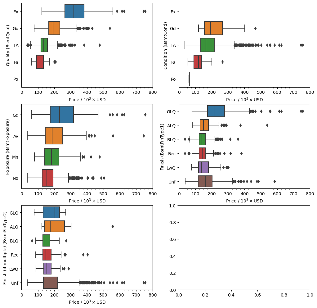
What we can see here is that there is a stronger correlation between the sale price of a house and the basement quality ('BsmtQual') and condition ('BsmtCond') than with the other categorical features. From before we are missing values in the 'BsmtExposure' and 'BsmtFinType2' features, but we have already seen that they should not be missing. Based on what I see on the plots above I believe it is safe to replace the missing values for the two rows with an imputed value based on
the mode of the column with respect to the neighborhood the house is in and the type of dwelling. Before we do so let’s make sure that this will actually make sense.
Here’s the data for the row missing the 'BsmtExposure' value.
[46]:
df.loc[(df['BsmtExposure'].isnull()) & (~df['BsmtCond'].isnull()),
       [x for x in df.columns if 'bsmt' in x.lower()]+['Neighborhood', 'MSSubClass']].T
[46]:
| Id | 949 |
|---|---|
| BsmtQual | Gd |
| BsmtCond | TA |
| BsmtExposure | NaN |
| BsmtFinType1 | Unf |
| BsmtFinSF1 | 0 |
| BsmtFinType2 | Unf |
| BsmtFinSF2 | 0 |
| BsmtUnfSF | 936 |
| TotalBsmtSF | 936 |
| BsmtFullBath | 0 |
| BsmtHalfBath | 0 |
| Neighborhood | CollgCr |
| MSSubClass | 60 |
A breakdown of the basement exposure for each dwelling type in the College Creek ('CollgCr') neighborhood.
[47]:
df.groupby(['Neighborhood', 'MSSubClass'])['BsmtExposure'].value_counts(dropna=False).loc['CollgCr']
[47]:
MSSubClass  BsmtExposure
120         Av               7
            Gd               2
            Mn               1
20          Av              35
            No              32
            Gd               8
            Mn               6
60          No              33
            Av              11
            Mn               7
            NaN              1
            Gd               1
80          Av               2
            Gd               1
85          Av               3
Name: count, dtype: int64
We know that our missing row has the label '60' for the dwelling type and we see that the mode is that there is no exposure. I believe this is a fair enough assumption given that this is a 2 story home. So let’s make the replacement in a generalized fashion with the transform method in pandas.
Some of the potential pitfalls of this type of replacement is that if the mode of the data is actually ``NaN`` then you may end up just replacing a ``NaN`` value with another ``NaN`` value.
[48]:
df['BsmtExposure'] = df.groupby(['Neighborhood', 'MSSubClass'])['BsmtExposure'].transform(fill_mode)
And now let’s look at the other problematic column, 'BsmtFinType2'.
Here is the data in the missing row.
[49]:
df.loc[(df['BsmtFinType2'].isnull()) & (~df['BsmtCond'].isnull()),
       [x for x in df.columns if 'bsmt' in x.lower()]+['Neighborhood', 'MSSubClass']].T
[49]:
| Id | 333 |
|---|---|
| BsmtQual | Gd |
| BsmtCond | TA |
| BsmtExposure | No |
| BsmtFinType1 | GLQ |
| BsmtFinSF1 | 1124 |
| BsmtFinType2 | NaN |
| BsmtFinSF2 | 479 |
| BsmtUnfSF | 1603 |
| TotalBsmtSF | 3206 |
| BsmtFullBath | 1 |
| BsmtHalfBath | 0 |
| Neighborhood | NridgHt |
| MSSubClass | 20 |
[50]:
df.groupby(['Neighborhood', 'MSSubClass'])['BsmtFinType2'].value_counts(dropna=False).loc['NridgHt']
[50]:
MSSubClass  BsmtFinType2
120         Unf             19
160         Unf              3
20          Unf             30
            ALQ              1
            NaN              1
60          Unf             23
Name: count, dtype: int64
So most of the houses actually don’t have a second type of finished basement, or it’s 'Unf'.
Let’s see what are the values for the 'BsmtFinType2' when the 'BsmtFinSF2' is greater than zero.
[51]:
df.loc[df['BsmtFinSF2'] > 0].groupby('MSSubClass').get_group('20')['BsmtFinType2'].value_counts()
[51]:
BsmtFinType2
Rec    29
LwQ    28
BLQ    17
ALQ     7
GLQ     5
Name: count, dtype: int64
And we see that the data should have a value that is not 'Unf'.
The problem with this row is that the mode for the finish type and the type of dwelling is actually unfinished, 'Unf', which would create a contradiction in the data. Since it is just one row I will actually drop it. In the grand scheme of things keeping this one row will not result in a large change in the final results.
[52]:
df.drop([333], inplace=True)
[53]:
missing_vals(df)
[53]:
| count | percent | |
|---|---|---|
| PoolQC | 1451 | 99.588195 |
| MiscFeature | 1403 | 96.293754 |
| Alley | 1366 | 93.754290 |
| Fence | 1176 | 80.713795 |
| FireplaceQu | 690 | 47.357584 |
| LotFrontage | 259 | 17.776253 |
| GarageType | 81 | 5.559369 |
| GarageYrBlt | 81 | 5.559369 |
| GarageFinish | 81 | 5.559369 |
| GarageQual | 81 | 5.559369 |
| GarageCond | 81 | 5.559369 |
And we have eliminated all missing data points pertaining to the basement.
Garage#
Here, I want to figure out the features pertaining to information on the garage. The values from the description file are.
GarageType: Garage location

       2Types   More than one type of garage
       Attchd   Attached to home
       Basment  Basement Garage
       BuiltIn  Built-In (Garage part of house - typically has room above garage)
       CarPort  Car Port
       Detchd   Detached from home
       NA   No Garage

GarageYrBlt: Year garage was built

GarageFinish: Interior finish of the garage

       Fin  Finished
       RFn  Rough Finished
       Unf  Unfinished
       NA   No Garage

GarageCars: Size of garage in car capacity

GarageArea: Size of garage in square feet

GarageQual: Garage quality

       Ex   Excellent
       Gd   Good
       TA   Typical/Average
       Fa   Fair
       Po   Poor
       NA   No Garage

GarageCond: Garage condition

       Ex   Excellent
       Gd   Good
       TA   Typical/Average
       Fa   Fair
       Po   Poor
       NA   No Garage
Let’s first take a look at the current state of the columns data.
[54]:
missing_vals(df).loc[['GarageType', 'GarageYrBlt', 'GarageFinish', 'GarageQual', 'GarageCond']]
[54]:
| count | percent | |
|---|---|---|
| GarageType | 81 | 5.559369 |
| GarageYrBlt | 81 | 5.559369 |
| GarageFinish | 81 | 5.559369 |
| GarageQual | 81 | 5.559369 |
| GarageCond | 81 | 5.559369 |
We see that the features that are missing data are all categorical features except for 'GarageYrBlt' which is for when the garage was built. However, if there is no garage then there will obviously be no year for when the garage was built.
First I want to make sure that where there is missing data the numerical values make sense.
[55]:
df.loc[df['GarageType'].isnull(), [x for x in df.columns if 'garage' in x.lower()]].value_counts(dropna=False)
[55]:
GarageType  GarageYrBlt  GarageFinish  GarageCars  GarageArea  GarageQual  GarageCond
NaN         NaN          NaN           0           0           NaN         NaN           81
Name: count, dtype: int64
And clearly we see that when the categorical data is missing a value the numerical value for 'GarageCars' and 'GarageArea' is 0. For the categorical data this is a simple replacement and we will replace all Nan with 'None'.
[56]:
cat_cols = ['GarageType', 'GarageFinish', 'GarageQual', 'GarageCond']
df[cat_cols] = df[cat_cols].fillna('None')
For 'GarageYrBlt' we do not have a nice and neat value that we can asign that makes complete sense. In a way we can set the value to 0 and force it to be an outlier. It can become an interesting thought experiment to try to reason what can happen to the model when do this as opposed to setting the value to some kind of mean based on where the house is located. Could it be that by setting the values to 0 will it affect the correlation between the sale price and the year the garage was built
or if there is a garage at all.
Let’s look at that really quick. Here is the correlation between sale price and garage year before replacing the missing values.
[57]:
df.corr(numeric_only=True).loc['GarageYrBlt', 'SalePrice']
[57]:
0.4867053251422345
And if we replace the missing values with 0.
[58]:
df_tmp = df.copy()
df_tmp['GarageYrBlt'] = df_tmp['GarageYrBlt'].fillna(0)
df_tmp.corr(numeric_only=True).loc['GarageYrBlt', 'SalePrice']
[58]:
0.2613300869851237
And if we replace the missing values with 100.
[59]:
df_tmp = df.copy()
df_tmp['GarageYrBlt'] = df_tmp['GarageYrBlt'].fillna(100)
df_tmp.corr(numeric_only=True).loc['GarageYrBlt', 'SalePrice']
[59]:
0.26261306587279576
And if we replace the missing values with 1000.
[60]:
df_tmp = df.copy()
df_tmp['GarageYrBlt'] = df_tmp['GarageYrBlt'].fillna(1000)
df_tmp.corr(numeric_only=True).loc['GarageYrBlt', 'SalePrice']
[60]:
0.28550228706456937
And if we replace the missing values with 1900.
[61]:
df_tmp = df.copy()
df_tmp['GarageYrBlt'] = df_tmp['GarageYrBlt'].fillna(1900)
df_tmp.corr(numeric_only=True).loc['GarageYrBlt', 'SalePrice']
[61]:
0.5185149371069989
And if we were to replace the missing values with some average with respect to the neighborhood.
[62]:
df_tmp = df.copy()
df_tmp['GarageYrBlt'] = df_tmp.groupby('Neighborhood')['GarageYrBlt'].transform(lambda x: x.fillna(x.mean()))
df_tmp.corr(numeric_only=True).loc['GarageYrBlt', 'SalePrice']
[62]:
0.5000940244955719
I believe this is actually a peculiar problem that requires some careful consideration. We can’t just make the year a garage was built to be the average when it does not exist and is it also good to create these outliers in the data set? Well, yes actually, because it can be said that the absence of a garage is actually having a very small effect on the sale price owing to a small correlation value between them. It will be interesting to actually create a few models to see the actual effect on the final results.
For now let’s just set them to 0.
[63]:
df['GarageYrBlt'] = df['GarageYrBlt'].fillna(0)
[64]:
missing_vals(df)
[64]:
| count | percent | |
|---|---|---|
| PoolQC | 1451 | 99.588195 |
| MiscFeature | 1403 | 96.293754 |
| Alley | 1366 | 93.754290 |
| Fence | 1176 | 80.713795 |
| FireplaceQu | 690 | 47.357584 |
| LotFrontage | 259 | 17.776253 |
And we no longer have any values pertaining to the garage.
Pool quality, Alley, Fence, Misc Feature#
Let’s quickly take care of the pool quality, alley, and fence values as we already know they should be 'None' when there are missing values. As alwys I just like to be careful where I can and cross check with data that is related in the data set already. This can only be done for the 'PoolQC', and 'MiscFeature' data.
[65]:
df.loc[df['PoolQC'].isnull(), ['PoolArea', 'PoolQC']].value_counts(dropna=False)
[65]:
PoolArea  PoolQC
0         NaN       1451
Name: count, dtype: int64
[66]:
df.loc[df['MiscFeature'].isnull(), ['MiscVal', 'MiscFeature']].value_counts(dropna=False)
[66]:
MiscVal  MiscFeature
0        NaN            1403
Name: count, dtype: int64
[67]:
df.loc[df['FireplaceQu'].isnull(), ['Fireplaces', 'FireplaceQu']].value_counts(dropna=False)
[67]:
Fireplaces  FireplaceQu
0           NaN            690
Name: count, dtype: int64
And now that we have confirmed that when 'PoolQC' is missing a value the value for 'PoolArea' is 0, we make the replacement.
[68]:
cat_cols = ['PoolQC', 'Alley', 'Fence', 'MiscFeature', 'FireplaceQu']
df[cat_cols] = df[cat_cols].fillna('None')
[69]:
missing_vals(df)
[69]:
| count | percent | |
|---|---|---|
| LotFrontage | 259 | 17.776253 |
Lot Frontage#
And we are left with dealing with missing values for the lot frontage. Here is the description for the feature.
LotFrontage: Linear feet of street connected to property
For this value we will have to go through different values and make an attempt to guess based on other values. So let’s first look at the correlation metrics as this will be a good starting point to see what values are connected.
[70]:
df.corr(numeric_only=True)['LotFrontage'].sort_values(key=abs, ascending=False).head(8)
[70]:
LotFrontage     1.000000
1stFlrSF        0.406596
LotArea         0.388597
SalePrice       0.370210
GrLivArea       0.355398
TotRmsAbvGrd    0.336123
TotalBsmtSF     0.323647
GarageArea      0.322424
Name: LotFrontage, dtype: float64
[71]:
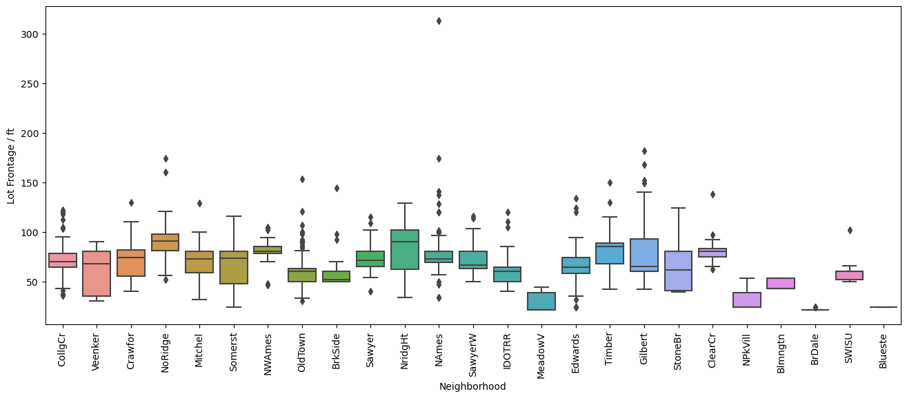
plt.figure(figsize=(16,6), dpi=100)
sns.boxplot(y='LotFrontage', x='Neighborhood', data=df, orient='vertical')
plt.xticks(rotation=90)
plt.ylabel('Lot Frontage / ft')
[71]:
Text(0, 0.5, 'Lot Frontage / ft')
[72]:
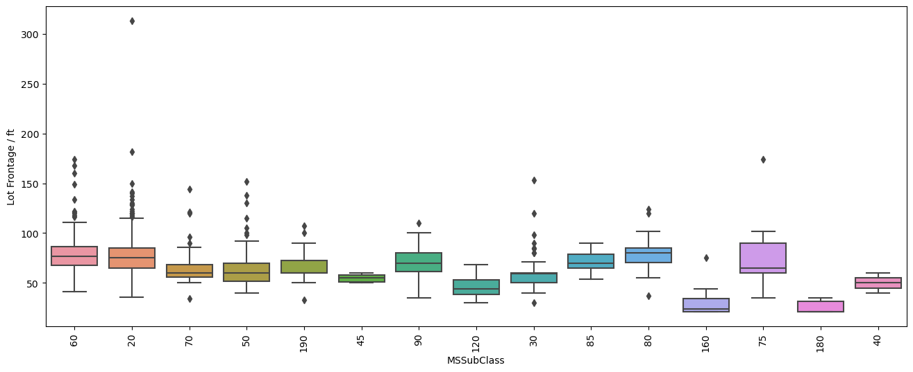
plt.figure(figsize=(16,6), dpi=100)
sns.boxplot(y='LotFrontage', x='MSSubClass', data=df, orient='vertical')
plt.xticks(rotation=90)
plt.ylabel('Lot Frontage / ft')
[72]:
Text(0, 0.5, 'Lot Frontage / ft')
[73]:
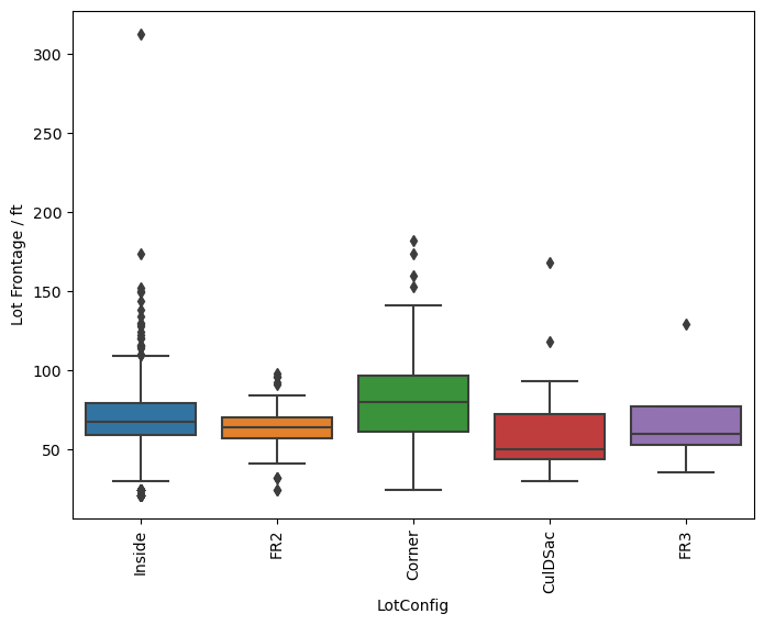
plt.figure(figsize=(8,6), dpi=100)
sns.boxplot(y='LotFrontage', x='LotConfig', data=df, orient='vertical')
plt.xticks(rotation=90)
plt.ylabel('Lot Frontage / ft')
[73]:
Text(0, 0.5, 'Lot Frontage / ft')
[74]:
plt.figure(figsize=(8,6), dpi=100)
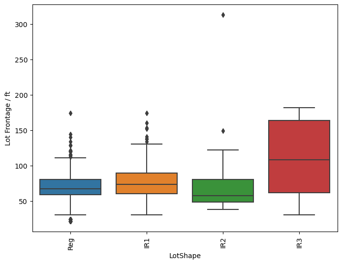
sns.boxplot(y='LotFrontage', x='LotShape', data=df, orient='vertical')
plt.xticks(rotation=90)
plt.ylabel('Lot Frontage / ft')
[74]:
Text(0, 0.5, 'Lot Frontage / ft')
[75]:
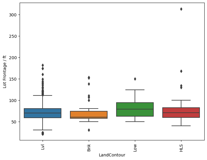
plt.figure(figsize=(8,6), dpi=100)
sns.boxplot(y='LotFrontage', x='LandContour', data=df, orient='vertical')
plt.xticks(rotation=90)
plt.ylabel('Lot Frontage / ft')
[75]:
Text(0, 0.5, 'Lot Frontage / ft')
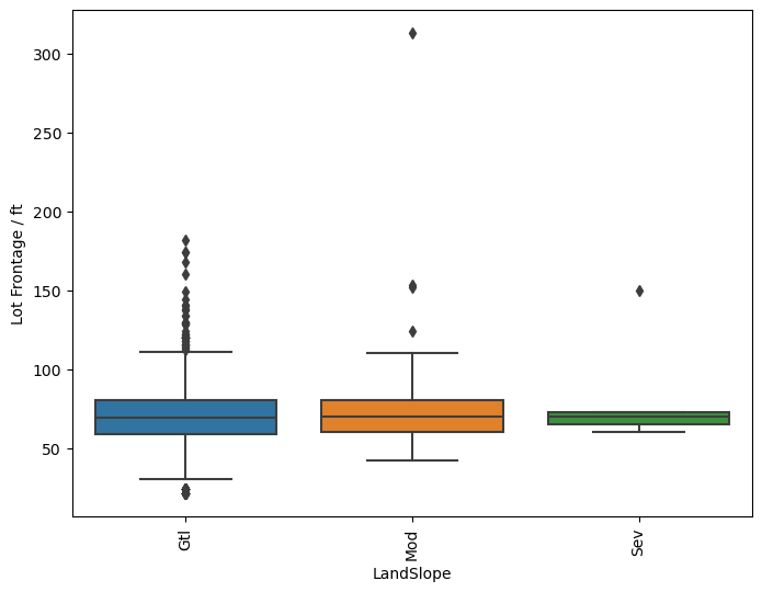
[76]:
plt.figure(figsize=(8,6), dpi=100)
sns.boxplot(y='LotFrontage', x='LandSlope', data=df, orient='vertical')
plt.xticks(rotation=90)
plt.ylabel('Lot Frontage / ft')
[76]:
Text(0, 0.5, 'Lot Frontage / ft')
[77]:
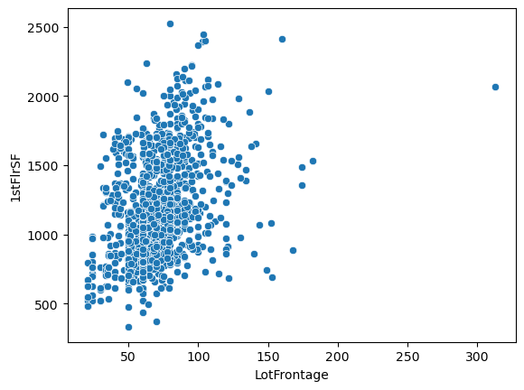
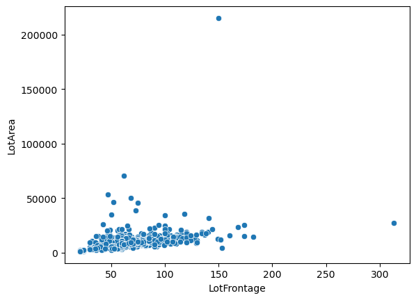
sns.scatterplot(x='LotFrontage', y='1stFlrSF', data=df)
[77]:
<Axes: xlabel='LotFrontage', ylabel='1stFlrSF'>
[78]:
sns.scatterplot(x='LotFrontage', y='LotArea', data=df)
[78]:
<Axes: xlabel='LotFrontage', ylabel='LotArea'>
[79]:
df.loc[df['LotArea'] > 200e3]
[79]:
| MSSubClass | MSZoning | LotFrontage | LotArea | Street | Alley | LotShape | LandContour | Utilities | LotConfig | ... | PoolArea | PoolQC | Fence | MiscFeature | MiscVal | MoSold | YrSold | SaleType | SaleCondition | SalePrice | |
|---|---|---|---|---|---|---|---|---|---|---|---|---|---|---|---|---|---|---|---|---|---|
| Id | |||||||||||||||||||||
| 314 | 20 | RL | 150.0 | 215245 | Pave | None | IR3 | Low | AllPub | Inside | ... | 0 | None | None | None | 0 | 6 | 2009 | WD | Normal | 375000 |
1 rows × 80 columns
[80]:
df.loc[df['LotFrontage'] > 300]
[80]:
| MSSubClass | MSZoning | LotFrontage | LotArea | Street | Alley | LotShape | LandContour | Utilities | LotConfig | ... | PoolArea | PoolQC | Fence | MiscFeature | MiscVal | MoSold | YrSold | SaleType | SaleCondition | SalePrice | |
|---|---|---|---|---|---|---|---|---|---|---|---|---|---|---|---|---|---|---|---|---|---|
| Id | |||||||||||||||||||||
| 935 | 20 | RL | 313.0 | 27650 | Pave | None | IR2 | HLS | AllPub | Inside | ... | 0 | None | None | None | 0 | 11 | 2008 | WD | Normal | 242000 |
1 rows × 80 columns
[81]:
sns.scatterplot(x='LotFrontage', y='SalePrice', data=df)
[81]:
<Axes: xlabel='LotFrontage', ylabel='SalePrice'>
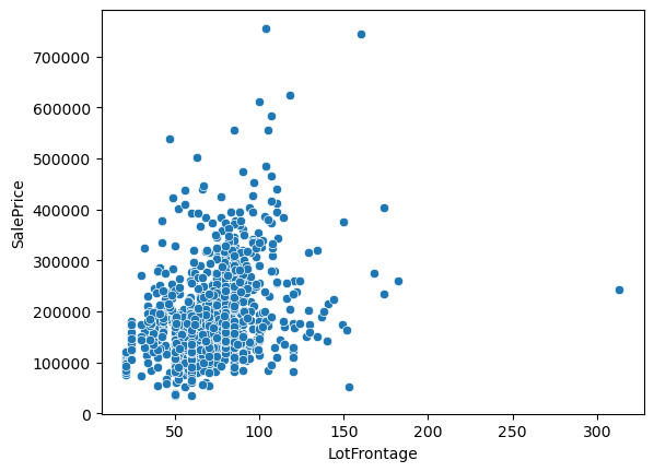
So what do we see from all these plots?
Well the first one comparing the distribution of lot frontage values as a function of the neighborhood does not show a lot of variation between the values. In some neighborhoods the distribution seems to be smaller, in others there are less points that fall outside of the \(1.5\times \text{IQR}\) limits set by Seaborn in the box plots. Same applies to the next plot with dwelling types, 'MSSubClass'. It’s not until we get to comparing the values of lot area and lot frontage that we get a
good linear trend between the two values with exception of two outliers.
Based on this I will use a linear interpolation to fill in the missing values for the 'LotFrontage' column.
[82]:
def func(x, a, b):
    return a*x+b
tmp = df.loc[(df['LotArea'] < 200e3) & (df['LotFrontage'] < 300)][['LotArea', 'LotFrontage']]
popt, pcov = curve_fit(f=func, xdata=tmp['LotArea'].values, ydata=tmp['LotFrontage'].values)
Before we make the replacement lets take a look at how the line fit looks.
[83]:
sns.scatterplot(y='LotFrontage', x='LotArea', data=tmp)
x = np.linspace(0, 70e3, 20)
plt.plot(x, func(x, *popt), color='tab:red', linestyle='--')
[83]:
[<matplotlib.lines.Line2D at 0x1c879d69650>]
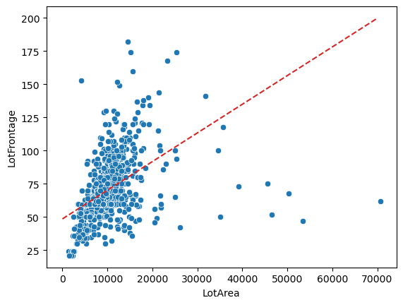
That’s a pretty terrible fit. Due to this issue we will have to use another method to impute the values.
Based on the previous plots we see that there is a small dependence on the lot frontage values on which neighborhood we are in. So let’s take a look at the averages that we can get only from the neighborhoods and try to mix it up invloving the type of dwelling 'MSSubClass', lot configuration 'LotConfig', or 'LotShape'.
[84]:
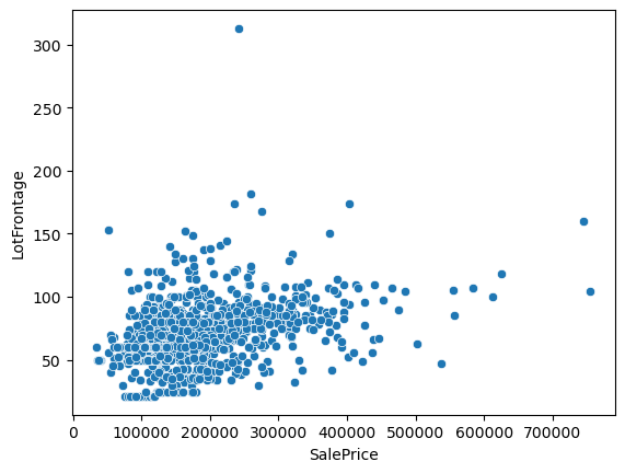
sns.scatterplot(y='LotFrontage', x='SalePrice', data=df)
[84]:
<Axes: xlabel='SalePrice', ylabel='LotFrontage'>
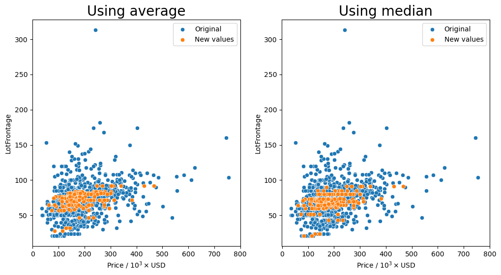
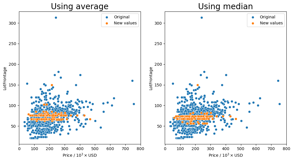
Group by the 'Neighborhood' column and transform missing values (orange markers) with the average or median.
[85]:
gen_lotfront_plot(df, 'Neighborhood')
Missing values after average: 0
Missing values after median: 0
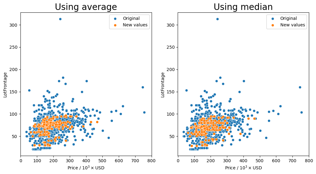
Group by the 'Neighborhood', 'MSSubClass', and 'MSZoning' columns and transform missing values (orange markers) with the average or median.
[86]:
gen_lotfront_plot(df, ['Neighborhood', 'MSSubClass', 'MSZoning'])
Missing values after average: 11
Missing values after median: 11
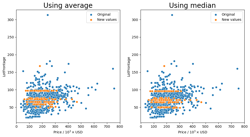
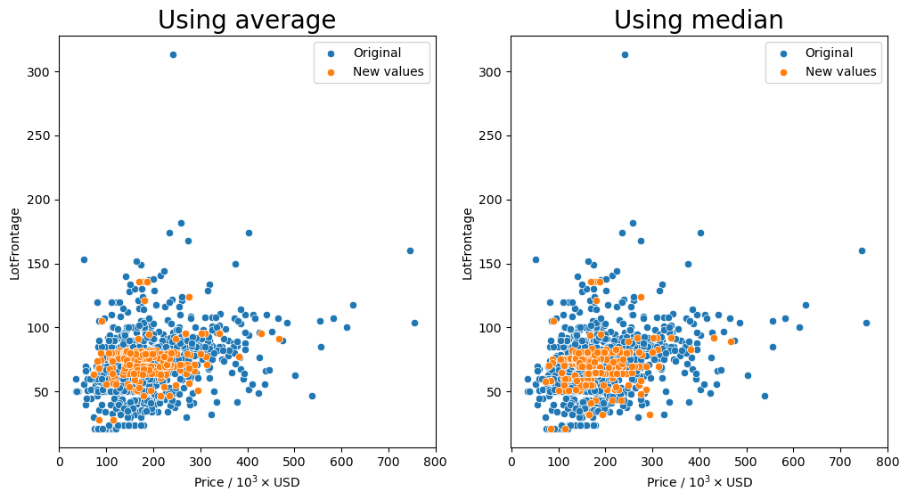
Group by the 'LontConfig', and 'LotShape' columns and transform missing values (orange markers) with the average or median.
[87]:
gen_lotfront_plot(df, ['LotConfig', 'LotShape'])
Missing values after average: 1
Missing values after median: 1
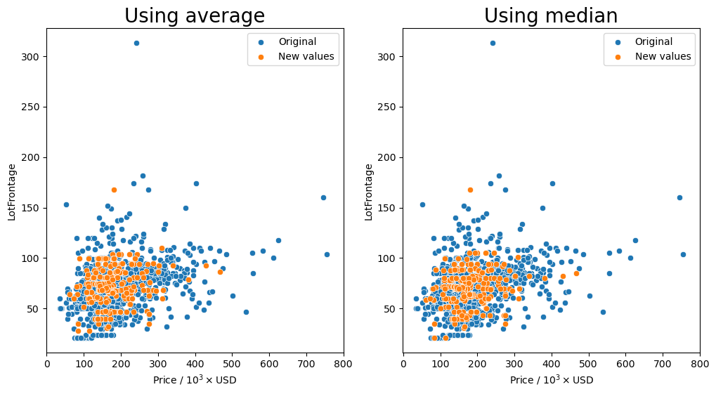
Group by the 'Neighborhood', 'LontConfig', and 'LotShape' columns and transform missing values (orange markers) with the average or median.
[88]:
gen_lotfront_plot(df, ['LotConfig', 'LotShape', 'Neighborhood'])
Missing values after average: 33
Missing values after median: 33
Group by the 'LandContour', and 'LotShape' columns and transform missing values (orange markers) with the average or median.
[89]:
gen_lotfront_plot(df, ['LandContour', 'LotShape'])
Missing values after average: 0
Missing values after median: 0
Group by the 'Neighborhood', 'LandContour', and 'LotShape' columns and transform missing values (orange markers) with the average or median.
[90]:
gen_lotfront_plot(df, ['LandContour', 'LotShape', 'Neighborhood'])
Missing values after average: 21
Missing values after median: 21
It seems that for most of the combinations that we tried for how to group the values, having the 'Neighborhood' column in the group seemed to keep the resulting values fairly consistent as shown by the orange markers. We see that they are spread out throughout the entire middle section with most of the other data points.
So the question remains, which is the best method? Just transforming the missing values in the data set with the average for each neighborhood seems to behave well enough as we have seen that there is a small dependence on the lot frontage and the neighborhood. However, I would argue that the shape and the configuration of the lot are equally as important. We can see in the box plots that the distribution of lot frontage values with respect to the lot configuration ('LotConfig') and lot
shape ('LotShape') does vary from one to the other. The 'IR3' values in 'LotShape' have a very wide distribution and it makes sense to separate those values from the rest as it can affect the average that is calculated.
As always this is mainly just an educated guess on what is the best method to deal with the missing numerical values. I believe that this method tries to take many different parameters that can affect the lot frontage value and gives a more realistic value. You will always have outliers, but I think this is the best that we can some up with.
So I will make the replacement of the missing values with a transformed average after grouping by 'Neighborhood', 'LotConfig', and 'LotShape'. But, there is one big issue with this. There are still missing values in the 'LotFrontage' column meaning that there are not enough data points in the groups to calculate the average this way. Seeing as grouping by just the 'Neighborhood' fills in all the missing values, I will just group by the 'Neighborhood' column and fill
in the calculated average.
[91]:
group_cols = ['Neighborhood']
df['LotFrontage'] = df.groupby(group_cols)['LotFrontage'].transform(lambda x: x.fillna(x.mean()))
[92]:
missing_vals(df)
[92]:
| count | percent |
|---|
And we are done replacing all of the missing values in the data set and can start to actually use it for predictions!!
[93]:
df_objs = df.select_dtypes(include='object')
df_nums = df.select_dtypes(exclude='object')
[94]:
df_objs.info()
<class 'pandas.core.frame.DataFrame'>
Index: 1457 entries, 1 to 1460
Data columns (total 44 columns):
 #   Column         Non-Null Count  Dtype
---  ------         --------------  -----
 0   MSSubClass     1457 non-null   object
 1   MSZoning       1457 non-null   object
 2   Street         1457 non-null   object
 3   Alley          1457 non-null   object
 4   LotShape       1457 non-null   object
 5   LandContour    1457 non-null   object
 6   Utilities      1457 non-null   object
 7   LotConfig      1457 non-null   object
 8   LandSlope      1457 non-null   object
 9   Neighborhood   1457 non-null   object
 10  Condition1     1457 non-null   object
 11  Condition2     1457 non-null   object
 12  BldgType       1457 non-null   object
 13  HouseStyle     1457 non-null   object
 14  RoofStyle      1457 non-null   object
 15  RoofMatl       1457 non-null   object
 16  Exterior1st    1457 non-null   object
 17  Exterior2nd    1457 non-null   object
 18  MasVnrType     1457 non-null   object
 19  ExterQual      1457 non-null   object
 20  ExterCond      1457 non-null   object
 21  Foundation     1457 non-null   object
 22  BsmtQual       1457 non-null   object
 23  BsmtCond       1457 non-null   object
 24  BsmtExposure   1457 non-null   object
 25  BsmtFinType1   1457 non-null   object
 26  BsmtFinType2   1457 non-null   object
 27  Heating        1457 non-null   object
 28  HeatingQC      1457 non-null   object
 29  CentralAir     1457 non-null   object
 30  Electrical     1457 non-null   object
 31  KitchenQual    1457 non-null   object
 32  Functional     1457 non-null   object
 33  FireplaceQu    1457 non-null   object
 34  GarageType     1457 non-null   object
 35  GarageFinish   1457 non-null   object
 36  GarageQual     1457 non-null   object
 37  GarageCond     1457 non-null   object
 38  PavedDrive     1457 non-null   object
 39  PoolQC         1457 non-null   object
 40  Fence          1457 non-null   object
 41  MiscFeature    1457 non-null   object
 42  SaleType       1457 non-null   object
 43  SaleCondition  1457 non-null   object
dtypes: object(44)
memory usage: 512.2+ KB
[95]:
df_nums.info()
<class 'pandas.core.frame.DataFrame'>
Index: 1457 entries, 1 to 1460
Data columns (total 36 columns):
 #   Column         Non-Null Count  Dtype
---  ------         --------------  -----
 0   LotFrontage    1457 non-null   float64
 1   LotArea        1457 non-null   int64
 2   OverallQual    1457 non-null   int64
 3   OverallCond    1457 non-null   int64
 4   YearBuilt      1457 non-null   int64
 5   YearRemodAdd   1457 non-null   int64
 6   MasVnrArea     1457 non-null   float64
 7   BsmtFinSF1     1457 non-null   int64
 8   BsmtFinSF2     1457 non-null   int64
 9   BsmtUnfSF      1457 non-null   int64
 10  TotalBsmtSF    1457 non-null   int64
 11  1stFlrSF       1457 non-null   int64
 12  2ndFlrSF       1457 non-null   int64
 13  LowQualFinSF   1457 non-null   int64
 14  GrLivArea      1457 non-null   int64
 15  BsmtFullBath   1457 non-null   int64
 16  BsmtHalfBath   1457 non-null   int64
 17  FullBath       1457 non-null   int64
 18  HalfBath       1457 non-null   int64
 19  BedroomAbvGr   1457 non-null   int64
 20  KitchenAbvGr   1457 non-null   int64
 21  TotRmsAbvGrd   1457 non-null   int64
 22  Fireplaces     1457 non-null   int64
 23  GarageYrBlt    1457 non-null   float64
 24  GarageCars     1457 non-null   int64
 25  GarageArea     1457 non-null   int64
 26  WoodDeckSF     1457 non-null   int64
 27  OpenPorchSF    1457 non-null   int64
 28  EnclosedPorch  1457 non-null   int64
 29  3SsnPorch      1457 non-null   int64
 30  ScreenPorch    1457 non-null   int64
 31  PoolArea       1457 non-null   int64
 32  MiscVal        1457 non-null   int64
 33  MoSold         1457 non-null   int64
 34  YrSold         1457 non-null   int64
 35  SalePrice      1457 non-null   int64
dtypes: float64(3), int64(33)
memory usage: 421.2 KB
[96]:
df_objs = pd.get_dummies(df_objs, drop_first=True)
Save the final data set after processing#
[97]:
final_df = pd.concat([df_nums, df_objs], axis=1)
[98]:
final_df.to_csv(os.path.join('_data', 'ames-data-no-missing.csv'))
Linear Regression#
Import linear regression libraries#
[99]:
from sklearn.linear_model import LinearRegression, RidgeCV, LassoCV, ElasticNetCV
from sklearn.model_selection import train_test_split
from sklearn.preprocessing import StandardScaler
from sklearn import metrics
[100]:
def convert_strings(num, base):
    length = int(np.floor(np.log10(num)))
    if length < base:
        s = '0'+str(round(num, -(base-2)))[:2]
    elif length == base:
        s = str(round(num, -(base-2)))[:3]
    else:
        raise ValueError('The length of the number to round is larger')
    return '{}.{}E+{:02d}'.format(s[0], s[1:], base)

def gen_comp_plot(title, pred, test, ax, avg, metrics, alpha=0.3, text_tmp=None):
    if text_tmp is None:
        text_tmp = error_text
    base = int(np.floor(np.log10(avg_price)))
    str_vals = [convert_strings(avg, base),
                convert_strings(metrics['MAE'], base),
                convert_strings(metrics['MedAE'], base),
                convert_strings(metrics['RMSE'], base),
                metrics['r2']]
    sns.scatterplot(x=test, y=pred, alpha=0.3, ax=ax)
    replace_price_ticks(ax, True, 'Actual sale price')
    replace_price_ticks(ax, False, 'Predicted sale price')
    ylim = ax.get_ylim()
    xlim = ax.get_xlim()
    new_lim = list(ylim)
    if new_lim[0] > xlim[0]:
        new_lim[0] = xlim[0]
    if new_lim[1] < xlim[1]:
        new_lim[1] = xlim[1]
    ax.set_ylim(new_lim)
    ax.set_xlim(new_lim)
    ax.plot(new_lim, new_lim, color='tab:red', linestyle='--')
    ax.text(s=text_tmp.format(*str_vals),
            x=0.025, y=0.97, transform=ax.transAxes, ha='left', va='top',
            bbox=dict(fc="none"))
    ax.set_title(title)
[101]:
error_text = '''\
- Average sale price: {}
- Mean absolute error: {}
- Median absolute error: {}
- Root mean squared error: {}
- R Squared: {:.4f}\
'''

errors = {}
alphas = {}
test_preds = {}
models = {}
Data manipulation#
[102]:
dtypes = dict(MSSubClass=str)
df = pd.read_csv(os.path.join('_data', 'ames-data-no-missing.csv'), index_col=0)
[103]:
np.where(df.isnull().any())
[103]:
(array([], dtype=int64),)
Make a train test split#
[104]:
X = df.drop('SalePrice', axis=1)
y = df['SalePrice']
[105]:
X_train, X_test, y_train, y_test = train_test_split(X, y, test_size=0.15, random_state=42)
avg_price = y_test.mean()
Scale the data#
[106]:
scaler = StandardScaler()
scaler.fit(X_train)
X_train_scaled = scaler.transform(X_train)
X_test_scaled = scaler.transform(X_test)
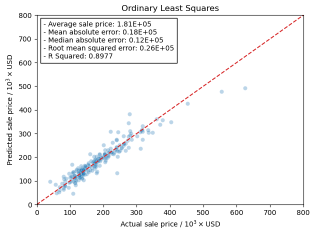
Ordinary least squares#
[107]:
model = LinearRegression()
[108]:
model.fit(X_train, y_train)
models['ols'] = model
[109]:
test_predictions = models['ols'].predict(X_test)
MAE = metrics.mean_absolute_error(y_test, test_predictions)
MSE = metrics.mean_squared_error(y_test, test_predictions)
RMSE = np.sqrt(MSE)
r2 = metrics.r2_score(y_test, test_predictions)
MedAE = metrics.median_absolute_error(y_test, test_predictions)
test_preds['ols'] = test_predictions
errors['ols'] = dict(MAE=MAE, MSE=MSE, RMSE=RMSE,
                    MedAE=MedAE, r2=r2)
Plotting real vs. predicted values#
[110]:
fig, ax = plt.subplots()
gen_comp_plot('Ordinary Least Squares', test_preds['ols'], y_test, ax,
              avg_price, errors['ols'])
fig.tight_layout()
Ridge Regression#
Now I will use the scaled training data and train the models using the RidgeCV model in the linear_regression module in scikit-learn. This will let me more easily tune the hyper-parameter, \(\alpha\), rather than running a grid search. The reason I am doing this is that RidgeCV will use a scoring function to determine the best hyper-parameter. This is more of a curiosity of mine to see how the scoring actually affects the final results from training the model.
[111]:
models['ridge'] = {}
errors['ridge'] = {}
test_preds['ridge'] = {}
Mean Absolute Error#
Here we use the mean absolute error as the scoring metric in the training step.
[112]:
model = RidgeCV(alphas=np.arange(350, 360, 0.05), scoring='neg_mean_absolute_error')
[113]:
model.fit(X_train_scaled, y_train)
[113]:
RidgeCV(alphas=array([350.  , 350.05, 350.1 , 350.15, 350.2 , 350.25, 350.3 , 350.35,
       350.4 , 350.45, 350.5 , 350.55, 350.6 , 350.65, 350.7 , 350.75,
       350.8 , 350.85, 350.9 , 350.95, 351.  , 351.05, 351.1 , 351.15,
       351.2 , 351.25, 351.3 , 351.35, 351.4 , 351.45, 351.5 , 351.55,
       351.6 , 351.65, 351.7 , 351.75, 351.8 , 351.85, 351.9 , 351.95,
       352.  , 352.05, 352.1 , 352.15, 352.2 , 352.25, 352.3 , 352.35,
       352.4 , 352.45, 352.5 ,...
       357.2 , 357.25, 357.3 , 357.35, 357.4 , 357.45, 357.5 , 357.55,
       357.6 , 357.65, 357.7 , 357.75, 357.8 , 357.85, 357.9 , 357.95,
       358.  , 358.05, 358.1 , 358.15, 358.2 , 358.25, 358.3 , 358.35,
       358.4 , 358.45, 358.5 , 358.55, 358.6 , 358.65, 358.7 , 358.75,
       358.8 , 358.85, 358.9 , 358.95, 359.  , 359.05, 359.1 , 359.15,
       359.2 , 359.25, 359.3 , 359.35, 359.4 , 359.45, 359.5 , 359.55,
       359.6 , 359.65, 359.7 , 359.75, 359.8 , 359.85, 359.9 , 359.95]),
        scoring='neg_mean_absolute_error')
In a Jupyter environment, please rerun this cell to show the HTML representation or trust the notebook. On GitHub, the HTML representation is unable to render, please try loading this page with nbviewer.org.
RidgeCV(alphas=array([350.  , 350.05, 350.1 , 350.15, 350.2 , 350.25, 350.3 , 350.35,
       350.4 , 350.45, 350.5 , 350.55, 350.6 , 350.65, 350.7 , 350.75,
       350.8 , 350.85, 350.9 , 350.95, 351.  , 351.05, 351.1 , 351.15,
       351.2 , 351.25, 351.3 , 351.35, 351.4 , 351.45, 351.5 , 351.55,
       351.6 , 351.65, 351.7 , 351.75, 351.8 , 351.85, 351.9 , 351.95,
       352.  , 352.05, 352.1 , 352.15, 352.2 , 352.25, 352.3 , 352.35,
       352.4 , 352.45, 352.5 ,...
       357.2 , 357.25, 357.3 , 357.35, 357.4 , 357.45, 357.5 , 357.55,
       357.6 , 357.65, 357.7 , 357.75, 357.8 , 357.85, 357.9 , 357.95,
       358.  , 358.05, 358.1 , 358.15, 358.2 , 358.25, 358.3 , 358.35,
       358.4 , 358.45, 358.5 , 358.55, 358.6 , 358.65, 358.7 , 358.75,
       358.8 , 358.85, 358.9 , 358.95, 359.  , 359.05, 359.1 , 359.15,
       359.2 , 359.25, 359.3 , 359.35, 359.4 , 359.45, 359.5 , 359.55,
       359.6 , 359.65, 359.7 , 359.75, 359.8 , 359.85, 359.9 , 359.95]),
        scoring='neg_mean_absolute_error')
[114]:
models['ridge']['MAE'] = model
alphas['MAE'] = model.alpha_
model.alpha_
[114]:
354.500000000001
[115]:
test_predictions = models['ridge']['MAE'].predict(X_test_scaled)
MAE = metrics.mean_absolute_error(y_test, test_predictions)
MSE = metrics.mean_squared_error(y_test, test_predictions)
RMSE = np.sqrt(MSE)
r2 = metrics.r2_score(y_test, test_predictions)
MedAE = metrics.median_absolute_error(y_test, test_predictions)
MAPerE = metrics.mean_absolute_percentage_error(y_test, test_predictions)
errors['ridge']['MAE'] = dict(MAE=MAE, MSE=MSE, RMSE=RMSE,
                       r2=r2, MedAE=MedAE, MAPerE=MAPerE)
test_preds['ridge']['MAE'] = test_predictions
Mean Squared Error or Root Mean Squared Error#
Here we use the mean squared error as the scoring metric in the training step. According to the documentation on scikit-learn, if you want to use the root mean squared error as the scoring metric you end up just using mean squared error. Which makes sense honestly.
[116]:
model = RidgeCV(alphas=np.arange(185, 195, 0.05), scoring='neg_mean_squared_error')
[117]:
model.fit(X_train_scaled, y_train)
[117]:
RidgeCV(alphas=array([185.  , 185.05, 185.1 , 185.15, 185.2 , 185.25, 185.3 , 185.35,
       185.4 , 185.45, 185.5 , 185.55, 185.6 , 185.65, 185.7 , 185.75,
       185.8 , 185.85, 185.9 , 185.95, 186.  , 186.05, 186.1 , 186.15,
       186.2 , 186.25, 186.3 , 186.35, 186.4 , 186.45, 186.5 , 186.55,
       186.6 , 186.65, 186.7 , 186.75, 186.8 , 186.85, 186.9 , 186.95,
       187.  , 187.05, 187.1 , 187.15, 187.2 , 187.25, 187.3 , 187.35,
       187.4 , 187.45, 187.5 ,...
       192.2 , 192.25, 192.3 , 192.35, 192.4 , 192.45, 192.5 , 192.55,
       192.6 , 192.65, 192.7 , 192.75, 192.8 , 192.85, 192.9 , 192.95,
       193.  , 193.05, 193.1 , 193.15, 193.2 , 193.25, 193.3 , 193.35,
       193.4 , 193.45, 193.5 , 193.55, 193.6 , 193.65, 193.7 , 193.75,
       193.8 , 193.85, 193.9 , 193.95, 194.  , 194.05, 194.1 , 194.15,
       194.2 , 194.25, 194.3 , 194.35, 194.4 , 194.45, 194.5 , 194.55,
       194.6 , 194.65, 194.7 , 194.75, 194.8 , 194.85, 194.9 , 194.95]),
        scoring='neg_mean_squared_error')
In a Jupyter environment, please rerun this cell to show the HTML representation or trust the notebook. On GitHub, the HTML representation is unable to render, please try loading this page with nbviewer.org.
RidgeCV(alphas=array([185.  , 185.05, 185.1 , 185.15, 185.2 , 185.25, 185.3 , 185.35,
       185.4 , 185.45, 185.5 , 185.55, 185.6 , 185.65, 185.7 , 185.75,
       185.8 , 185.85, 185.9 , 185.95, 186.  , 186.05, 186.1 , 186.15,
       186.2 , 186.25, 186.3 , 186.35, 186.4 , 186.45, 186.5 , 186.55,
       186.6 , 186.65, 186.7 , 186.75, 186.8 , 186.85, 186.9 , 186.95,
       187.  , 187.05, 187.1 , 187.15, 187.2 , 187.25, 187.3 , 187.35,
       187.4 , 187.45, 187.5 ,...
       192.2 , 192.25, 192.3 , 192.35, 192.4 , 192.45, 192.5 , 192.55,
       192.6 , 192.65, 192.7 , 192.75, 192.8 , 192.85, 192.9 , 192.95,
       193.  , 193.05, 193.1 , 193.15, 193.2 , 193.25, 193.3 , 193.35,
       193.4 , 193.45, 193.5 , 193.55, 193.6 , 193.65, 193.7 , 193.75,
       193.8 , 193.85, 193.9 , 193.95, 194.  , 194.05, 194.1 , 194.15,
       194.2 , 194.25, 194.3 , 194.35, 194.4 , 194.45, 194.5 , 194.55,
       194.6 , 194.65, 194.7 , 194.75, 194.8 , 194.85, 194.9 , 194.95]),
        scoring='neg_mean_squared_error')
[118]:
models['ridge']['MSE'] = model
alphas['MSE'] = model.alpha_
model.alpha_
[118]:
190.15000000000117
[119]:
test_predictions = models['ridge']['MSE'].predict(X_test_scaled)
MAE = metrics.mean_absolute_error(y_test, test_predictions)
MSE = metrics.mean_squared_error(y_test, test_predictions)
RMSE = np.sqrt(MSE)
r2 = metrics.r2_score(y_test, test_predictions)
MedAE = metrics.median_absolute_error(y_test, test_predictions)
MAPerE = metrics.mean_absolute_percentage_error(y_test, test_predictions)
errors['ridge']['MSE'] = dict(MAE=MAE, MSE=MSE, RMSE=RMSE,
                       r2=r2, MedAE=MedAE, MAPerE=MAPerE)
errors['ridge']['RMSE'] = dict(MAE=MAE, MSE=MSE, RMSE=RMSE,
                       r2=r2, MedAE=MedAE, MAPerE=MAPerE)
test_preds['ridge']['MSE'] = test_predictions
R Squared (coefficient of determination)#
Here we use R squared as the scoring metric in the training step.
[120]:
model = RidgeCV(alphas=np.arange(185, 195, 0.05), scoring='r2')
[121]:
model.fit(X_train_scaled, y_train)
[121]:
RidgeCV(alphas=array([185.  , 185.05, 185.1 , 185.15, 185.2 , 185.25, 185.3 , 185.35,
       185.4 , 185.45, 185.5 , 185.55, 185.6 , 185.65, 185.7 , 185.75,
       185.8 , 185.85, 185.9 , 185.95, 186.  , 186.05, 186.1 , 186.15,
       186.2 , 186.25, 186.3 , 186.35, 186.4 , 186.45, 186.5 , 186.55,
       186.6 , 186.65, 186.7 , 186.75, 186.8 , 186.85, 186.9 , 186.95,
       187.  , 187.05, 187.1 , 187.15, 187.2 , 187.25, 187.3 , 187.35,
       187.4 , 187.45, 187.5 ,...
       192.2 , 192.25, 192.3 , 192.35, 192.4 , 192.45, 192.5 , 192.55,
       192.6 , 192.65, 192.7 , 192.75, 192.8 , 192.85, 192.9 , 192.95,
       193.  , 193.05, 193.1 , 193.15, 193.2 , 193.25, 193.3 , 193.35,
       193.4 , 193.45, 193.5 , 193.55, 193.6 , 193.65, 193.7 , 193.75,
       193.8 , 193.85, 193.9 , 193.95, 194.  , 194.05, 194.1 , 194.15,
       194.2 , 194.25, 194.3 , 194.35, 194.4 , 194.45, 194.5 , 194.55,
       194.6 , 194.65, 194.7 , 194.75, 194.8 , 194.85, 194.9 , 194.95]),
        scoring='r2')
In a Jupyter environment, please rerun this cell to show the HTML representation or trust the notebook. On GitHub, the HTML representation is unable to render, please try loading this page with nbviewer.org.
RidgeCV(alphas=array([185.  , 185.05, 185.1 , 185.15, 185.2 , 185.25, 185.3 , 185.35,
       185.4 , 185.45, 185.5 , 185.55, 185.6 , 185.65, 185.7 , 185.75,
       185.8 , 185.85, 185.9 , 185.95, 186.  , 186.05, 186.1 , 186.15,
       186.2 , 186.25, 186.3 , 186.35, 186.4 , 186.45, 186.5 , 186.55,
       186.6 , 186.65, 186.7 , 186.75, 186.8 , 186.85, 186.9 , 186.95,
       187.  , 187.05, 187.1 , 187.15, 187.2 , 187.25, 187.3 , 187.35,
       187.4 , 187.45, 187.5 ,...
       192.2 , 192.25, 192.3 , 192.35, 192.4 , 192.45, 192.5 , 192.55,
       192.6 , 192.65, 192.7 , 192.75, 192.8 , 192.85, 192.9 , 192.95,
       193.  , 193.05, 193.1 , 193.15, 193.2 , 193.25, 193.3 , 193.35,
       193.4 , 193.45, 193.5 , 193.55, 193.6 , 193.65, 193.7 , 193.75,
       193.8 , 193.85, 193.9 , 193.95, 194.  , 194.05, 194.1 , 194.15,
       194.2 , 194.25, 194.3 , 194.35, 194.4 , 194.45, 194.5 , 194.55,
       194.6 , 194.65, 194.7 , 194.75, 194.8 , 194.85, 194.9 , 194.95]),
        scoring='r2')
[122]:
models['ridge']['r2'] = model
alphas['r2'] = model.alpha_
model.alpha_
[122]:
190.15000000000117
[123]:
test_predictions = models['ridge']['r2'].predict(X_test_scaled)
MAE = metrics.mean_absolute_error(y_test, test_predictions)
MSE = metrics.mean_squared_error(y_test, test_predictions)
RMSE = np.sqrt(MSE)
r2 = metrics.r2_score(y_test, test_predictions)
MedAE = metrics.median_absolute_error(y_test, test_predictions)
MAPerE = metrics.mean_absolute_percentage_error(y_test, test_predictions)
errors['ridge']['r2'] = dict(MAE=MAE, MSE=MSE, RMSE=RMSE,
                       r2=r2, MedAE=MedAE, MAPerE=MAPerE)
print(error_text.format(y_test.mean(), MAE, RMSE, MedAE, r2))
test_preds['ridge']['r2'] = test_predictions
- Average sale price: 181122.35616438356
- Mean absolute error: 17800.40465778638
- Median absolute error: 26864.900197008257
- Root mean squared error: 12640.520799038932
- R Squared: 0.8909
Median Absolute Error#
Here we use the median absolute error as the scoring metric in the training step.
[124]:
model = RidgeCV(alphas=np.arange(740, 750, 0.05), scoring='neg_median_absolute_error')
[125]:
model.fit(X_train_scaled, y_train)
[125]:
RidgeCV(alphas=array([740.  , 740.05, 740.1 , 740.15, 740.2 , 740.25, 740.3 , 740.35,
       740.4 , 740.45, 740.5 , 740.55, 740.6 , 740.65, 740.7 , 740.75,
       740.8 , 740.85, 740.9 , 740.95, 741.  , 741.05, 741.1 , 741.15,
       741.2 , 741.25, 741.3 , 741.35, 741.4 , 741.45, 741.5 , 741.55,
       741.6 , 741.65, 741.7 , 741.75, 741.8 , 741.85, 741.9 , 741.95,
       742.  , 742.05, 742.1 , 742.15, 742.2 , 742.25, 742.3 , 742.35,
       742.4 , 742.45, 742.5 ,...
       747.2 , 747.25, 747.3 , 747.35, 747.4 , 747.45, 747.5 , 747.55,
       747.6 , 747.65, 747.7 , 747.75, 747.8 , 747.85, 747.9 , 747.95,
       748.  , 748.05, 748.1 , 748.15, 748.2 , 748.25, 748.3 , 748.35,
       748.4 , 748.45, 748.5 , 748.55, 748.6 , 748.65, 748.7 , 748.75,
       748.8 , 748.85, 748.9 , 748.95, 749.  , 749.05, 749.1 , 749.15,
       749.2 , 749.25, 749.3 , 749.35, 749.4 , 749.45, 749.5 , 749.55,
       749.6 , 749.65, 749.7 , 749.75, 749.8 , 749.85, 749.9 , 749.95]),
        scoring='neg_median_absolute_error')
In a Jupyter environment, please rerun this cell to show the HTML representation or trust the notebook. On GitHub, the HTML representation is unable to render, please try loading this page with nbviewer.org.
RidgeCV(alphas=array([740.  , 740.05, 740.1 , 740.15, 740.2 , 740.25, 740.3 , 740.35,
       740.4 , 740.45, 740.5 , 740.55, 740.6 , 740.65, 740.7 , 740.75,
       740.8 , 740.85, 740.9 , 740.95, 741.  , 741.05, 741.1 , 741.15,
       741.2 , 741.25, 741.3 , 741.35, 741.4 , 741.45, 741.5 , 741.55,
       741.6 , 741.65, 741.7 , 741.75, 741.8 , 741.85, 741.9 , 741.95,
       742.  , 742.05, 742.1 , 742.15, 742.2 , 742.25, 742.3 , 742.35,
       742.4 , 742.45, 742.5 ,...
       747.2 , 747.25, 747.3 , 747.35, 747.4 , 747.45, 747.5 , 747.55,
       747.6 , 747.65, 747.7 , 747.75, 747.8 , 747.85, 747.9 , 747.95,
       748.  , 748.05, 748.1 , 748.15, 748.2 , 748.25, 748.3 , 748.35,
       748.4 , 748.45, 748.5 , 748.55, 748.6 , 748.65, 748.7 , 748.75,
       748.8 , 748.85, 748.9 , 748.95, 749.  , 749.05, 749.1 , 749.15,
       749.2 , 749.25, 749.3 , 749.35, 749.4 , 749.45, 749.5 , 749.55,
       749.6 , 749.65, 749.7 , 749.75, 749.8 , 749.85, 749.9 , 749.95]),
        scoring='neg_median_absolute_error')
[126]:
models['ridge']['MedAE'] = model
alphas['MedAE'] = model.alpha_
model.alpha_
[126]:
748.799999999992
[127]:
test_predictions = models['ridge']['MedAE'].predict(X_test_scaled)
MAE = metrics.mean_absolute_error(y_test, test_predictions)
MSE = metrics.mean_squared_error(y_test, test_predictions)
RMSE = np.sqrt(MSE)
r2 = metrics.r2_score(y_test, test_predictions)
MedAE = metrics.median_absolute_error(y_test, test_predictions)
MAPerE = metrics.mean_absolute_percentage_error(y_test, test_predictions)
errors['ridge']['MedAE'] = dict(MAE=MAE, MSE=MSE, RMSE=RMSE,
                       r2=r2, MedAE=MedAE, MAPerE=MAPerE)
test_preds['ridge']['MedAE'] = test_predictions
Mean Absolute Percentage Error#
Here we use the mean absolute percentage error as the scoring metric in the training step.
[128]:
model = RidgeCV(alphas=np.arange(1020, 1030, 0.05), scoring='neg_mean_absolute_percentage_error')
[129]:
model.fit(X_train_scaled, y_train)
[129]:
RidgeCV(alphas=array([1020.  , 1020.05, 1020.1 , 1020.15, 1020.2 , 1020.25, 1020.3 ,
       1020.35, 1020.4 , 1020.45, 1020.5 , 1020.55, 1020.6 , 1020.65,
       1020.7 , 1020.75, 1020.8 , 1020.85, 1020.9 , 1020.95, 1021.  ,
       1021.05, 1021.1 , 1021.15, 1021.2 , 1021.25, 1021.3 , 1021.35,
       1021.4 , 1021.45, 1021.5 , 1021.55, 1021.6 , 1021.65, 1021.7 ,
       1021.75, 1021.8 , 1021.85, 1021.9 , 1021.95, 1022.  , 1022.05,
       1022.1 , 1022.15, 1...
       1027.7 , 1027.75, 1027.8 , 1027.85, 1027.9 , 1027.95, 1028.  ,
       1028.05, 1028.1 , 1028.15, 1028.2 , 1028.25, 1028.3 , 1028.35,
       1028.4 , 1028.45, 1028.5 , 1028.55, 1028.6 , 1028.65, 1028.7 ,
       1028.75, 1028.8 , 1028.85, 1028.9 , 1028.95, 1029.  , 1029.05,
       1029.1 , 1029.15, 1029.2 , 1029.25, 1029.3 , 1029.35, 1029.4 ,
       1029.45, 1029.5 , 1029.55, 1029.6 , 1029.65, 1029.7 , 1029.75,
       1029.8 , 1029.85, 1029.9 , 1029.95]),
        scoring='neg_mean_absolute_percentage_error')
In a Jupyter environment, please rerun this cell to show the HTML representation or trust the notebook. On GitHub, the HTML representation is unable to render, please try loading this page with nbviewer.org.
RidgeCV(alphas=array([1020.  , 1020.05, 1020.1 , 1020.15, 1020.2 , 1020.25, 1020.3 ,
       1020.35, 1020.4 , 1020.45, 1020.5 , 1020.55, 1020.6 , 1020.65,
       1020.7 , 1020.75, 1020.8 , 1020.85, 1020.9 , 1020.95, 1021.  ,
       1021.05, 1021.1 , 1021.15, 1021.2 , 1021.25, 1021.3 , 1021.35,
       1021.4 , 1021.45, 1021.5 , 1021.55, 1021.6 , 1021.65, 1021.7 ,
       1021.75, 1021.8 , 1021.85, 1021.9 , 1021.95, 1022.  , 1022.05,
       1022.1 , 1022.15, 1...
       1027.7 , 1027.75, 1027.8 , 1027.85, 1027.9 , 1027.95, 1028.  ,
       1028.05, 1028.1 , 1028.15, 1028.2 , 1028.25, 1028.3 , 1028.35,
       1028.4 , 1028.45, 1028.5 , 1028.55, 1028.6 , 1028.65, 1028.7 ,
       1028.75, 1028.8 , 1028.85, 1028.9 , 1028.95, 1029.  , 1029.05,
       1029.1 , 1029.15, 1029.2 , 1029.25, 1029.3 , 1029.35, 1029.4 ,
       1029.45, 1029.5 , 1029.55, 1029.6 , 1029.65, 1029.7 , 1029.75,
       1029.8 , 1029.85, 1029.9 , 1029.95]),
        scoring='neg_mean_absolute_percentage_error')
[130]:
models['ridge']['MAPerE'] = model
alphas['MAPerE'] = model.alpha_
model.alpha_
[130]:
1024.2499999999961
[131]:
test_predictions = models['ridge']['MAPerE'].predict(X_test_scaled)
MAE = metrics.mean_absolute_error(y_test, test_predictions)
MSE = metrics.mean_squared_error(y_test, test_predictions)
RMSE = np.sqrt(MSE)
r2 = metrics.r2_score(y_test, test_predictions)
MedAE = metrics.median_absolute_error(y_test, test_predictions)
MAPerE = metrics.mean_absolute_percentage_error(y_test, test_predictions)
errors['ridge']['MAPerE'] = dict(MAE=MAE, MSE=MSE, RMSE=RMSE,
                       r2=r2, MedAE=MedAE, MAPerE=MAPerE)
test_preds['ridge']['MAPerE'] = test_predictions
Analyzing error metrics#
[132]:
error_df = pd.DataFrame.from_dict(errors['ridge']).T
ndf = pd.concat([error_df, pd.Series(alphas.values(), index=alphas.keys(), name='alpha')], axis=1)
ndf.index.name = 'scoring'
ndf.columns.name = 'metric'
ndf
[132]:
| metric | MAE | MSE | RMSE | r2 | MedAE | MAPerE | alpha |
|---|---|---|---|---|---|---|---|
| scoring | |||||||
| MAE | 17968.776853 | 7.523634e+08 | 27429.243295 | 0.886246 | 12030.073612 | 0.108136 | 354.50 |
| MSE | 17800.404658 | 7.217229e+08 | 26864.900197 | 0.890878 | 12640.520799 | 0.108687 | 190.15 |
| RMSE | 17800.404658 | 7.217229e+08 | 26864.900197 | 0.890878 | 12640.520799 | 0.108687 | NaN |
| r2 | 17800.404658 | 7.217229e+08 | 26864.900197 | 0.890878 | 12640.520799 | 0.108687 | 190.15 |
| MedAE | 18385.122105 | 8.222842e+08 | 28675.498464 | 0.875674 | 11674.233991 | 0.108510 | 748.80 |
| MAPerE | 18686.683333 | 8.697449e+08 | 29491.437899 | 0.868498 | 12247.473170 | 0.109258 | 1024.25 |
Plotting error metrics#
Below is a plot of the error metric values as a function of the scoring metric that we used in the training step.
The acronyms are: - MAE: Mean Absolute Error - MSE: Mean Squared Error - RMSE: Root Mean Squared Error (not exactly using it as a scoring metric when training the model just wanted to make a better comparison to MAE) - r2: R Squared - MedAE: Median Absolute Error - MAPerE: Mean Absolute Percentage Error
[133]:
mapper = dict(MAE='Mean Absolute Error (MAE)', MSE='Mean Squared Error (MSE)',
              RMSE='Root Mean Squared Error (RMSE)', r2='R Squared (r2)',
              MedAE='Median Absolute Error (MedAE)',
              MAPerE='Mean Absolute Percentage Error (MAPerE)')
# error_df.drop('MAPerE', axis=0, inplace=True)
# error_df.drop('MAPerE', axis=1, inplace=True)
fig, ax = plt.subplots(nrows=3, ncols=2, figsize=(9,8))
ax = np.ndarray.flatten(ax)
for i, col in enumerate(error_df.columns):
    d = error_df[col]
    ax[i].plot(d.index, d)
    ax[i].set_title(mapper[col])
    ax[i].set_xlabel('Scoring metric used when training')
fig.tight_layout()
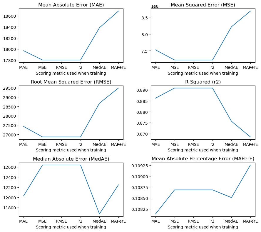
Plotting real vs. predicted values#
[134]:
fig, ax = plt.subplots(ncols=2, nrows=3, figsize=(10, 14))
ax = np.ndarray.flatten(ax)
base = int(np.floor(np.log10(y_test.mean())))
for idx, (key, value) in enumerate(test_preds['ridge'].items()):
    str_vals = [convert_strings(y_test.mean(), base),
                convert_strings(errors['ridge'][key]['MAE'], base),
                convert_strings(errors['ridge'][key]['MedAE'], base),
                convert_strings(errors['ridge'][key]['RMSE'], base),
                errors['ridge'][key]['r2']]
    sns.scatterplot(x=y_test, y=value, alpha=0.3, ax=ax[idx])
    replace_price_ticks(ax[idx], True, 'Actual Sale Price / USD')
    replace_price_ticks(ax[idx], False, 'Predicted Sale Price / USD')
    xlim = ax[idx].get_xlim()
    new_lim = list(ax[idx].get_ylim())
    if new_lim[0] > xlim[0]: new_lim[0] = xlim[0]
    if new_lim[1] < xlim[1]: new_lim[1] = xlim[1]
    ax[idx].set_ylim(new_lim)
    ax[idx].set_xlim(new_lim)
    ax[idx].plot(new_lim, new_lim, color='tab:red', linestyle='--')
    ax[idx].text(s='Scoring function\n{}\n'.format(mapper[key])+error_text.format(*str_vals), x=0.025, y=0.97,
               transform=ax[idx].transAxes, ha='left', va='top',
               bbox=dict(fc='none'))
fig.suptitle('Ridge Regression', fontsize=22)
fig.tight_layout()
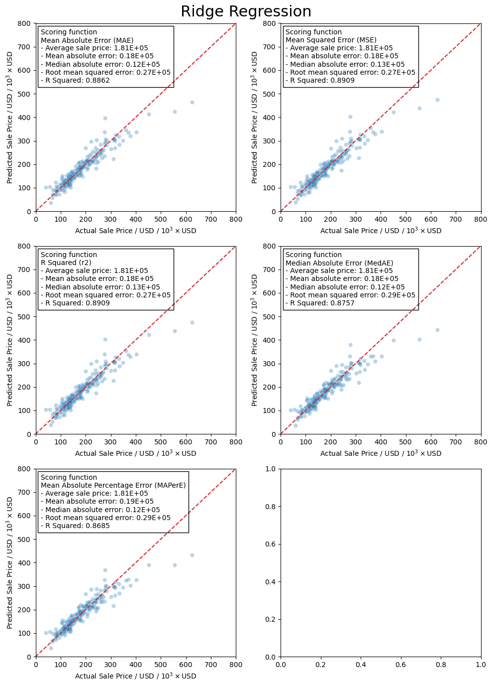
LASSO regression#
[135]:
model = LassoCV(n_alphas=1000, eps=0.001, max_iter=10000)
[136]:
model.fit(X_train_scaled, y_train)
[136]:
LassoCV(max_iter=10000, n_alphas=1000)In a Jupyter environment, please rerun this cell to show the HTML representation or trust the notebook.
On GitHub, the HTML representation is unable to render, please try loading this page with nbviewer.org.
LassoCV(max_iter=10000, n_alphas=1000)
[137]:
models['lasso'] = model
model.alpha_
[137]:
342.5806017461771
[138]:
test_predictions = model.predict(X_test_scaled)
MAE = metrics.mean_absolute_error(y_test, test_predictions)
MSE = metrics.mean_squared_error(y_test, test_predictions)
RMSE = np.sqrt(MSE)
r2 = metrics.r2_score(y_test, test_predictions)
MedAE = metrics.median_absolute_error(y_test, test_predictions)
MAPerE = metrics.mean_absolute_percentage_error(y_test, test_predictions)
test_preds['lasso'] = test_predictions
errors['lasso'] = dict(MAE=MAE, MSE=MSE, RMSE=RMSE,
                    MedAE=MedAE, r2=r2)
Plotting real vs. predicted values#
[139]:
fig, ax = plt.subplots()
gen_comp_plot('Lasso regression', test_predictions, y_test, ax,
              avg_price, errors['lasso'])
fig.tight_layout()
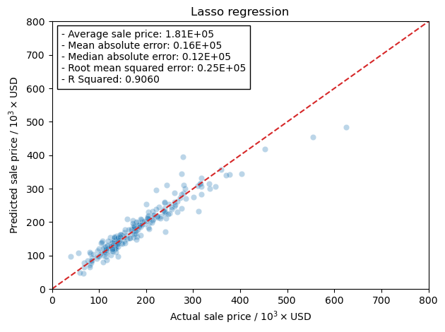
Elastic Net#
[140]:
model = ElasticNetCV(l1_ratio=np.arange(0.1, 1.1, 0.1), n_alphas=1000, eps=0.001, max_iter=int(1e5))
[141]:
model.fit(X_train_scaled, y_train)
[141]:
ElasticNetCV(l1_ratio=array([0.1, 0.2, 0.3, 0.4, 0.5, 0.6, 0.7, 0.8, 0.9, 1. ]),
             max_iter=100000, n_alphas=1000)
In a Jupyter environment, please rerun this cell to show the HTML representation or trust the notebook. On GitHub, the HTML representation is unable to render, please try loading this page with nbviewer.org.
ElasticNetCV(l1_ratio=array([0.1, 0.2, 0.3, 0.4, 0.5, 0.6, 0.7, 0.8, 0.9, 1. ]),
             max_iter=100000, n_alphas=1000)
[142]:
models['elastic'] = model
model.alpha_
[142]:
342.5806017461771
[143]:
model.l1_ratio_
[143]:
1.0
[144]:
test_predictions = models['elastic'].predict(X_test_scaled)
MAE = metrics.mean_absolute_error(y_test, test_predictions)
MSE = metrics.mean_squared_error(y_test, test_predictions)
RMSE = np.sqrt(MSE)
r2 = metrics.r2_score(y_test, test_predictions)
MedAE = metrics.median_absolute_error(y_test, test_predictions)
test_preds['elastic'] = test_predictions
errors['elastic'] = dict(MAE=MAE, MSE=MSE, RMSE=RMSE,
                    MedAE=MedAE, r2=r2)
Plotting real vs. predicted values#
[145]:
fig, ax = plt.subplots()
title = 'Elastic net / $\lambda={}$'.format(model.l1_ratio_)
gen_comp_plot(title, test_preds['elastic'], y_test, ax,
              avg_price, errors['elastic'])
fig.tight_layout()
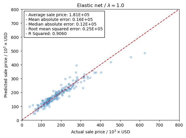
Conclusion#
First let’s put all of the models together with the plots of real vs. predicted in one large plot.
[146]:
fig, axs = plt.subplots(nrows=2, ncols=2, figsize=(10,10))
axs = np.ndarray.flatten(axs)
keys = ['ols', ['ridge', 'MAE'], 'lasso', 'elastic']
names = dict(ols='Ordinary Least Squares',
             ridge='Ridge Regression',
             lasso='LASSO regression',
             elastic='Elastic Net')
for idx, (ax, key) in enumerate(zip(axs, keys)):
    pred = test_preds[key] if not isinstance(key, list) else test_preds[key[0]][key[1]]
    name = names[key] if not isinstance(key, list) else names[key[0]]
    err = errors[key] if not isinstance(key, list) else errors[key[0]][key[1]]
    if name.startswith('Elastic'):
        name += ' / $\lambda={}$'.format(models['elastic'].l1_ratio_)
    gen_comp_plot('', pred, y_test, ax, avg_price, err, text_tmp=name+'\n'+error_text)
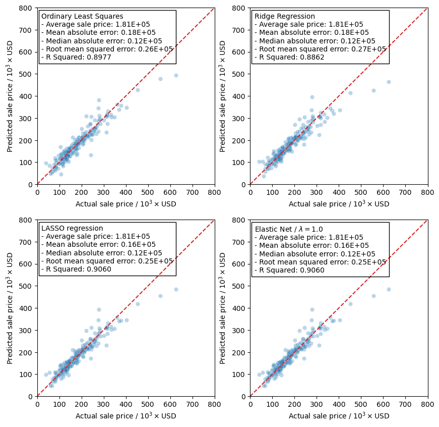
So what’s the final conclusion from all this. Well, it seems that the LASSO regression model actually gives the best predictions as it has the lowest error metrics and the best R squared value. This is further supported by the fact that the Elastic Net model prefers the LASSO regression model as it has a \(\lambda\) value of 1.0. Granted, all of the models actually seem to perform the same, and based on the results the use of any one of them in our test set should yield predictions with the same level of confidence.
What is interesting in this model, however, is that in our testing data we have the two points that are priced above 500,000. With the fitting parameters that we have it is possible that any predictions made above 500,000 may not be very accurate as they are not being included in the training data set. This could show a possible lack of data in that price range and possibly a lower confidence in the predictions.
[ ]: